You want to know what customers think about your website.
So you create a survey.
Then you add a question.
And another.
And another.
Before you know it...
your “quick survey” has 35 questions.
Now there's a new problem:
Nobody wants to complete it.
A website feedback survey can be incredibly useful.
But only if people actually respond.
The goal isn't to ask every question you can possibly think of.
The goal is to ask a small number of useful questions that help you understand:
What customers were trying to do.
Whether they succeeded.
What confused them.
What was difficult.
What information they needed.
And what could make the experience better.
Let's create a website feedback survey that respects the customer's time while giving your business useful information.
1. Start With a Clear Purpose
Before writing the first question, ask:
WHY ARE WE CREATING THIS SURVEY?
Maybe you want to understand:
- Overall website usability
- Mobile experience
- Service-page clarity
- Contact-form experience
- Checkout experience
- Booking experience
- Website navigation
- Content usefulness
Choose a purpose.
Without one, the survey can quickly become a collection of unrelated questions.
2. Decide What You Want to Learn
Suppose your goal is:
Improve the customer journey.
You might want to learn:
What brought visitors to the website?
What were they trying to accomplish?
Could they find what they needed?
What confused them?
Did they know what to do next?
Now your questions have direction.
3. Keep the Survey Short
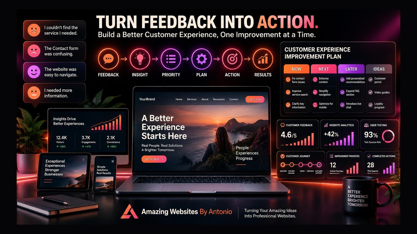
A website feedback survey should not feel like homework.
Ask only what you genuinely plan to use.
If a question won't influence a decision, ask whether you need it.
Shorter surveys can reduce unnecessary effort for respondents.
4. Set Expectations
Tell people what they're being asked to do.
For example:
“Help us improve our website. This short survey should take about 2 minutes.”
This helps visitors understand the commitment before beginning.
Only promise a completion time you've reasonably tested.
5. Start With an Easy Question
Don't begin with something complicated.
For example:
WHAT BROUGHT YOU TO OUR WEBSITE TODAY?
- □ Learn about services
- □ View past work
- □ Contact the business
- □ Find pricing
- □ Read a blog or resource
- □ Make a purchase
- □ Book a service
- □ Something else
This provides context for the rest of the feedback.
6. Ask What the Visitor Was Trying to Accomplish
One of the most valuable questions is:
WHAT WERE YOU TRYING TO DO ON OUR WEBSITE TODAY?
This tells you the visitor's goal.
Without that context, other answers may be harder to interpret.
7. Ask Whether They Accomplished It
Follow with:
WERE YOU ABLE TO COMPLETE WHAT YOU CAME HERE TO DO?
- □ Yes
- □ Partially
- □ No
Now you can connect intent with outcome.
8. Ask What Got in the Way
If someone answers “Partially” or “No,” ask:
WHAT MADE IT DIFFICULT?
Potential choices:
- □ I couldn't find the information
- □ The navigation was confusing
- □ The page was difficult to use
- □ The website was slow
- □ A form didn't work
- □ I needed more information
- □ Something else
Allow an optional comment when useful.
9. Ask About Findability
A useful question might be:
HOW EASY WAS IT TO FIND WHAT YOU NEEDED?
- Very Easy
- Easy
- Neutral
- Difficult
- Very Difficult
This can help reveal navigation and content-organization problems.
10. Ask About Clarity
For a business website, consider:
HOW CLEARLY DID THE WEBSITE EXPLAIN WHAT WE OFFER?
- Very Clearly
- Clearly
- Somewhat Clearly
- Not Very Clearly
- Not Clearly At All
If visitors don't understand the business, other improvements may not matter.
11. Ask Whether the Next Step Was Clear
A website should guide visitors.
Ask:
DID YOU KNOW WHAT TO DO NEXT?
- □ Yes
- □ Somewhat
- □ No
This can help evaluate calls to action and customer journey.
12. Ask About Missing Information
Try:
WAS THERE ANY INFORMATION YOU EXPECTED TO FIND BUT COULDN'T?
Provide an optional text box.
This can uncover:
Missing FAQs.
Missing pricing explanations.
Missing service details.
Missing process information.
Missing policies.
13. Ask About Mobile Experience When Relevant
If the person is using a phone or tablet, you might ask:
HOW EASY WAS THE WEBSITE TO USE ON YOUR DEVICE?
- Very Easy
- Easy
- Neutral
- Difficult
- Very Difficult
Device-specific feedback can reveal issues that desktop reviews miss.
14. Ask About Important Forms
If the survey follows a Contact or booking experience, ask:
HOW EASY WAS IT TO COMPLETE THE FORM?
- Very Easy
- Easy
- Neutral
- Difficult
- Very Difficult
Then provide an optional comment:
WHAT COULD MAKE THE FORM EASIER?
15. Ask One Open-Ended Improvement Question
A strong final question is:
IF YOU COULD IMPROVE ONE THING ABOUT THIS WEBSITE, WHAT WOULD IT BE?
One question can generate valuable ideas.
16. Don't Overload the Survey With Open-Ended Questions
Open-ended feedback can be useful.
But typing takes more effort than selecting an option.
Balance quick-answer questions with one or two opportunities for detailed feedback.
17. Avoid Leading Questions
Don't ask:
“Don't you agree that our new website is much easier to use?”
That pushes people toward a particular answer.
Instead ask:
“HOW EASY OR DIFFICULT WAS THE WEBSITE TO USE?”
Keep questions neutral.
18. Avoid Double-Barreled Questions
Don't ask:
“Was the website fast and easy to navigate?”
What if it was fast but difficult to navigate?
Ask separately:
“How was the website's speed?”
and:
“How easy was the website to navigate?”
One question should generally measure one thing.
19. Avoid Vague Questions
“What do you think?”
may produce vague answers.
Specific questions create more actionable information.
Ask about:
Navigation.
Content.
Forms.
Mobile experience.
Clarity.
Next steps.
20. Use Simple Language
Avoid unnecessary technical terminology.
Your visitors shouldn't need to know what:
UX.
CTA.
Information architecture.
Conversion funnel.
or responsive breakpoint
means to answer the survey.
Use customer-friendly language.
21. Make Rating Scales Consistent
If one question uses:
1 = Very Difficult
5 = Very Easy
don't suddenly reverse another question so:
1 = Excellent
5 = Terrible
Consistency reduces confusion.
22. Include “Not Applicable” When Necessary
Don't force someone to rate something they didn't use.
For example:
HOW EASY WAS THE CHECKOUT PROCESS?
If they didn't purchase anything, allow:
□ Not Applicable / I Didn't Use Checkout
This protects the quality of your data.
23. Don't Require Every Question
Some questions may be optional.
Only require information you truly need.
Too many required questions can make a survey frustrating.
24. Don't Ask for Personal Information You Don't Need
If the feedback can be useful without:
Name.
Phone number.
Address.
Birthday.
Other identifying information.
don't automatically collect it.
Collect information intentionally and responsibly.
25. Explain When Feedback Is Anonymous
If you've designed the survey to be anonymous, say so accurately.
Don't promise anonymity if your tools collect information that can identify respondents.
Understand your survey platform before making privacy claims.
26. Ask Permission Before Following Up
If you'd like to contact someone about their feedback, ask.
For example:
MAY WE CONTACT YOU ABOUT YOUR FEEDBACK?
- □ Yes
- □ No
If yes:
Email:
________________
Keep follow-up information separate where practical.
27. Don't Automatically Turn Survey Feedback Into Testimonials
Feedback and testimonials are different.
Someone giving private feedback isn't automatically giving permission for their comments to be published.
Get appropriate permission before displaying customer comments publicly.
28. Choose the Right Moment to Ask
Timing matters.
You might request feedback:
After someone submits a Contact form.
After completing a purchase.
After a booking.
After reading a resource.
After completing a project.
Or through a dedicated feedback page.
Choose a moment that makes sense.
29. Don't Interrupt People Too Early
Imagine entering a website and immediately seeing:
“HOW WAS YOUR EXPERIENCE?”
You haven't had an experience yet!
Give visitors enough time to use the website before requesting feedback.
30. Don't Block Important Actions
A feedback request shouldn't make it harder to:
Contact the business.
Buy something.
Book an appointment.
Read content.
Navigate.
Feedback should support the experience, not interrupt it unnecessarily.
31. Make the Survey Mobile-Friendly
Test it on a phone.
Check:
- Text size
- Buttons
- Radio selections
- Checkboxes
- Text boxes
- Scrolling
- Submit button
- Confirmation message
If the survey is difficult to complete on mobile, you may lose valuable responses.
32. Test the Survey Before Launching
Complete it yourself.
Then ask someone else to test it.
Check:
Does every question make sense?
Are any questions repetitive?
Do conditional questions work?
Does submission work?
Does the confirmation appear?
Are responses stored correctly?
33. Time Your Own Survey
If you tell visitors:
“This takes 2 minutes.”
test it.
Make sure that's realistic for a typical respondent.
34. Use Conditional Questions When Helpful
Conditional logic can keep surveys shorter.
For example:
WERE YOU ABLE TO FIND WHAT YOU NEEDED?
YES
→ Skip problem questions.
NO
→ Show:
“What were you unable to find?”
This creates a more relevant experience.
35. Create a Strong Confirmation Message
After submission, don't leave visitors wondering whether it worked.
For example:
THANK YOU FOR YOUR FEEDBACK!
Your response has been received.
We appreciate you taking the time to help us improve the Amazing Websites By Antonio website experience.
Simple.
Clear.
Appreciative.
36. Don't Promise That Every Suggestion Will Be Implemented
You can say:
“We review feedback as part of our website improvement process.”
Avoid:
“We will make every change you request.”
Feedback informs decisions.
It doesn't automatically control them.
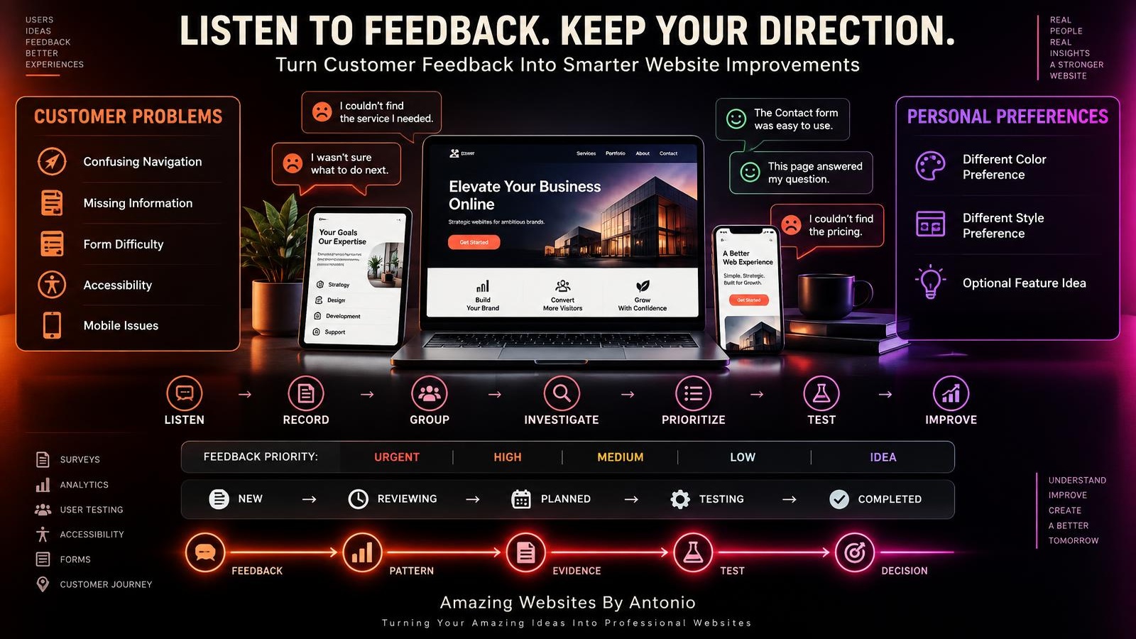
37. Organize the Responses
Group feedback into categories such as:
NAVIGATION
CONTENT
SERVICES
MOBILE
FORMS
ACCESSIBILITY
PERFORMANCE
DESIGN
TRUST
NEW IDEAS
This makes patterns easier to identify.
38. Count Repeated Themes
Suppose:
12 people mention difficulty finding Services.
8 mention unclear pricing.
1 dislikes the background color.
The repeated themes deserve attention.
Frequency isn't the only factor, but it's useful context.
39. Consider Severity Too
One report may still be urgent.
For example:
“I cannot complete checkout using keyboard navigation.”
Even if only one person reports it, investigate appropriately.
Don't prioritize only by vote count.
40. Separate Problems From Suggestions
Someone may say:
“Add a giant button to the homepage.”
The problem might actually be:
“I couldn't find how to contact you.”
Record:
PROBLEM:
Contact action difficult to find.
SUGGESTED SOLUTION:
Add giant button.
Now you can evaluate the best solution.
41. Connect Feedback to Analytics
Survey says:
“It's difficult to find the Contact page.”
Analytics show:
Few visitors reach Contact from important service pages.
Now you have multiple signals worth investigating.
42. Connect Feedback to User Testing
If survey respondents report confusing navigation, conduct a simple user test.
Ask participants to find an important service.
Observe what happens.
Use multiple forms of evidence.
43. Turn Feedback Into Questions
Don't immediately redesign.
Turn the response into a question.
FEEDBACK:
“It's hard to know which service I need.”
QUESTION:
Could the Services page explain differences between options more clearly?
Now you have something to investigate.
44. Turn Questions Into Tests
Create a hypothesis.
IF:
We add a simple service comparison...
THEN:
Visitors may choose the appropriate service more easily...
BECAUSE:
The differences will be clearer.
Then test the improvement.
45. Add Validated Improvements to Your Roadmap
Use:
NOW
NEXT
LATER
IDEAS
For example:
NOW:
Fix broken survey submission.
NEXT:
Improve Services explanation.
LATER:
Expand FAQ.
IDEAS:
Interactive service selector.
Your survey feeds your broader website strategy.
46. Create a Monthly Feedback Report
For example:
WEBSITE FEEDBACK REPORT
TOTAL RESPONSES:
__________
SUCCESSFULLY COMPLETED TASK:
__________%
MOST COMMON VISITOR GOAL:
__________
MOST COMMON PROBLEM:
__________
MOST REQUESTED INFORMATION:
__________
MOBILE CONCERN:
__________
TOP POSITIVE FEEDBACK:
__________
TOP IMPROVEMENT OPPORTUNITY:
__________
ACTION FOR NEXT MONTH:
__________
This turns responses into something useful.
47. Watch Trends Over Time
One month may show:
Navigation confusion.
After an improvement, the next month may show fewer navigation complaints.
That's useful.
Your survey can become part of an ongoing learning system.
48. Review Whether the Survey Itself Needs Improvement
Your survey isn't permanent.
Ask:
Are people abandoning it?
Are questions producing useful answers?
Are some questions unnecessary?
Have our business goals changed?
Improve the survey too.
49. Respect Privacy
Understand what your survey platform collects.
Only request information you have a reason to collect.
Store responses appropriately.
Keep private information private.
Maintain accurate privacy disclosures.
Follow applicable requirements for your business and jurisdiction.
Seek appropriate professional guidance when needed.
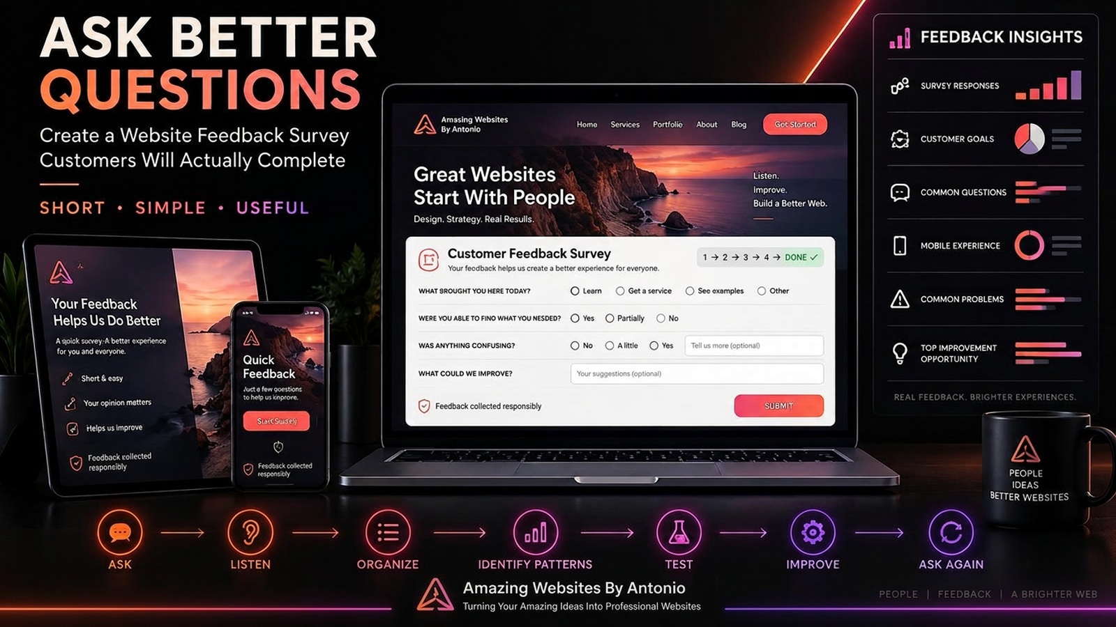
50. Turn the Survey Into a Learning Loop
The process can become:
ASK
↓
LISTEN
↓
ORGANIZE
↓
IDENTIFY PATTERNS
↓
INVESTIGATE
↓
PRIORITIZE
↓
TEST
↓
IMPROVE
↓
ASK AGAIN
Now feedback becomes an ongoing part of website improvement.
Website Feedback Survey Template
INTRO:
Help us improve our website!
We appreciate your feedback. This short survey should take about 2 minutes.
1. WHAT BROUGHT YOU TO OUR WEBSITE TODAY?
- □ Learn about services
- □ View past work
- □ Contact the business
- □ Find pricing
- □ Read a blog or resource
- □ Make a purchase
- □ Book a service
- □ Something else: __________
2. WHAT WERE YOU TRYING TO ACCOMPLISH?
________________________________
3. WERE YOU ABLE TO COMPLETE WHAT YOU CAME HERE TO DO?
- □ Yes
- □ Partially
- □ No
4. HOW EASY WAS IT TO FIND WHAT YOU NEEDED?
- □ Very Easy
- □ Easy
- □ Neutral
- □ Difficult
- □ Very Difficult
5. HOW CLEARLY DID THE WEBSITE EXPLAIN WHAT WE OFFER?
- □ Very Clearly
- □ Clearly
- □ Somewhat Clearly
- □ Not Very Clearly
- □ Not Clearly At All
6. DID YOU KNOW WHAT TO DO NEXT?
- □ Yes
- □ Somewhat
- □ No
7. WAS THERE ANY INFORMATION YOU EXPECTED TO FIND BUT COULDN'T?
________________________________
8. WAS ANYTHING DIFFICULT OR CONFUSING?
________________________________
9. IF YOU COULD IMPROVE ONE THING ABOUT THIS WEBSITE, WHAT WOULD IT BE?
________________________________
10. MAY WE CONTACT YOU ABOUT YOUR FEEDBACK?
- □ Yes
- □ No
If Yes:
Email: ________________________________
Thank-You Message:
Thank you for your feedback!
Your response has been received.
We appreciate you taking the time to help us improve the Amazing Websites By Antonio website experience.
Final Thoughts
A great website feedback survey isn't the one with the most questions.
It's the one that asks the right questions.
Keep it focused.
Respect people's time.
Use simple language.
Ask about real tasks.
Avoid leading questions.
Protect privacy.
Look for patterns.
Investigate problems.
Test solutions.
And use what you learn to make thoughtful improvements.
ASK → LISTEN → LEARN → IMPROVE → ASK AGAIN
Customer feedback becomes powerful when it leads to better questions and better decisions.
Don't collect feedback just to create another dashboard.
Collect it because you're prepared to learn from it.
Amazing Websites By Antonio
Turning Your Amazing Ideas Into Professional Websites