A Practical Guide to Tracking AI Performance, Understanding Customer Needs, and Making Better Website Decisions
Imagine opening your business website dashboard.
You see numbers everywhere.
Hundreds of conversations.
Dozens of customer questions.
Charts showing activity.
Graphs showing trends.
Percentages showing performance.
Everything looks impressive.
But there's one problem.
YOU DON'T KNOW WHAT TO DO WITH THE INFORMATION.
Are customers getting accurate answers?
Are they completing their tasks?
Are they becoming frustrated?
Are they reaching human support when needed?
And most importantly:
WHAT SHOULD YOU IMPROVE NEXT?
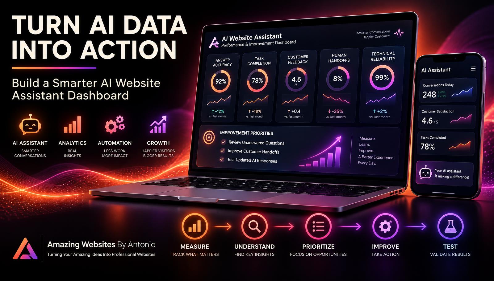
This is where an AI website assistant improvement dashboard becomes valuable.
A dashboard brings important information together in one organized place.
Instead of looking at disconnected numbers, you can see patterns, identify problems, and decide what actions to take.
But a dashboard shouldn't exist just to look professional.
A GOOD DASHBOARD HELPS YOU MAKE BETTER DECISIONS.
In Blog #107, we'll explore 50 practical ways to build an AI assistant improvement dashboard that turns data into meaningful action.
PART 1: UNDERSTAND THE PURPOSE OF YOUR DASHBOARD
1. Know What an AI Dashboard Does
An AI website assistant dashboard organizes information about how your assistant performs.
It may display accuracy, task completion, feedback, technical reliability, and customer support outcomes.
2. Focus on Decisions, Not Decorations
A dashboard filled with colorful charts isn't automatically useful.
Ask what decision each measurement supports.
3. Connect the Dashboard to Business Goals
Your dashboard should reflect what your assistant is supposed to accomplish.
For example:
- Help customers understand services
- Answer frequently asked questions
- Guide visitors to relevant pages
- Support project inquiries
- Provide appropriate human handoffs
4. Keep the First Version Simple
You don't need 30 charts to begin.
Start with a handful of meaningful measurements.
5. Define Who Will Use the Dashboard
For a solo entrepreneur, the dashboard may be designed primarily for the business owner.
Make it understandable without requiring advanced analytics expertise.
PART 2: CHOOSE YOUR MOST IMPORTANT METRICS
6. Track Answer Accuracy
Measure whether evaluated AI responses match approved business information.
Formula:
Correct Evaluated Answers ÷ Total Evaluated Answers × 100
7. Track Customer Task Completion
Measure whether visitors successfully accomplish the tasks they attempted.
Formula:
Successfully Completed Evaluated Tasks ÷ Total Evaluated Task Attempts × 100
8. Track Customer Helpfulness Feedback
Use feedback such as:
"Was this answer helpful?"
Track positive responses alongside the total number of responses.
9. Track Human Handoff Success
Measure whether customers successfully complete the available handoff process.
Don't confuse a submitted request with a fully resolved issue.
10. Track Technical Reliability
Monitor successful requests, failed requests, and relevant service interruptions.
PART 3: DESIGN YOUR DASHBOARD LAYOUT
11. Create a Clear Dashboard Header
Example:
AI WEBSITE ASSISTANT PERFORMANCE DASHBOARD
Reporting Period: [Month / Year]
12. Place Important Metrics at the Top
Use summary cards for your core measurements.
13. Group Related Information
Organize sections such as:
Performance.
Customer Feedback.
Human Support.
Technical Health.
Improvement Actions.
14. Use Understandable Labels
Instead of complicated technical terminology, use labels that explain what is being measured.
15. Include the Reporting Period
Every dashboard should clearly show the dates covered by its data.
PART 4: MAKE YOUR NUMBERS MEAN SOMETHING
16. Include the Sample Size
A 100% satisfaction rate based on two responses is different from a result based on hundreds of responses.
Show the number of observations behind percentages.
17. Distinguish Missing Data From Zero
If a measurement isn't available, display:
Not Measured
Don't automatically display 0%.
18. Compare Similar Reporting Periods
Use consistent time windows and definitions when comparing results.
19. Explain Significant Changes
If answer accuracy drops, investigate whether the knowledge base changed or the assistant encountered new questions.
20. Avoid Inventing Benchmarks
Targets should reflect your goals, risk tolerance, and observed performance.
Don't assume one percentage is appropriate for every business.
PART 5: CREATE USEFUL VISUALIZATIONS
21. Use Trend Charts
A line chart can help show how a metric changes over time.
22. Use Category Charts
A bar chart can show which question categories generate the most unresolved requests.
23. Use Status Indicators Carefully
Statuses such as:
Needs Review
On Track
Not Measured
can help organize attention.
Define the criteria for each status.
24. Avoid Too Many Visual Effects
Charts should be easy to read.
Professional design doesn't require unnecessary animation.
25. Make Visualizations Accessible
Use readable labels and don't rely on color alone to communicate meaning.
PART 6: UNDERSTAND CUSTOMER QUESTIONS
26. Track Common Question Categories
Examples:
Service Information.
Pricing.
Project Process.
Contact.
Technical Support.
27. Identify Unanswered Questions
Group questions the assistant cannot answer reliably.
28. Review Repeated Questions
Repeated questions may indicate unclear answers or missing website information.
29. Track Confusing Conversations
Identify cases where customers repeatedly rephrase their requests.
30. Turn Questions Into Content Improvements
If many visitors ask about a particular service, consider improving that service page or FAQ.
PART 7: EVALUATE CUSTOMER SUPPORT HANDOFFS
31. Track Handoff Requests
Record how frequently customers request personal assistance.
32. Track Completed Handoffs
Measure whether the customer successfully reaches the available support channel.
33. Review Handoff Failures
Look for broken forms, confusing instructions, or technical problems.
34. Track Follow-Up Status Where Appropriate
Use statuses such as:
New.
In Review.
Awaiting Customer.
Resolved.
Closed.
35. Respect Customer Privacy
Use aggregated or appropriately protected information in dashboard reports.
Avoid exposing unnecessary personal conversation details.
PART 8: BUILD AN IMPROVEMENT PRIORITY SYSTEM
36. Create an Improvement List
Record issues discovered through analytics, feedback, and testing.
37. Evaluate Customer Impact
Ask:
How many customers are affected?
How serious is the problem?
Does it prevent an important task?
38. Evaluate Business Impact
Consider whether the issue affects inquiries, service understanding, customer trust, or important workflows.
39. Consider Effort and Resources
Some improvements require only a content update.
Others may involve technical development or integration changes.
40. Prioritize Critical Issues First
Privacy, security, harmful misinformation, inaccessible essential functions, and broken critical workflows may require immediate attention.
Don't let a simple priority score override urgent risks.
PART 9: TURN DASHBOARD FINDINGS INTO ACTION
41. Create an Action Item for Each Important Problem
Example:
Problem: Customers cannot find the project intake form.
Action: Improve the assistant's guidance and link to the correct page.
42. Assign Responsibility
Record who will make the improvement.
43. Set a Review Date
Choose a realistic date for evaluating the change.
44. Document the Expected Result
Example:
"More customers should be able to locate the intake form successfully."
45. Retest After Changes
Check whether the improvement works and whether it creates any new problems.
PART 10: CREATE A DASHBOARD REVIEW ROUTINE
46. Review Critical Issues Promptly
Serious accuracy, privacy, security, or technical problems shouldn't wait for a monthly review.
47. Review Trends Regularly
A weekly or monthly review may be appropriate depending on website traffic and the assistant's role.
48. Keep a Decision Log
Record:
What you observed.
What you decided.
What you changed.
What happened afterward.
49. Improve the Dashboard Itself
Remove measurements that don't support decisions.
Add useful information when new needs emerge.
50. Focus on Continuous Improvement
Your dashboard is not the final destination.
It's a tool that helps you create better customer experiences.
MEASURE → UNDERSTAND → PRIORITIZE → IMPROVE → TEST → REPEAT
SAMPLE AI WEBSITE ASSISTANT DASHBOARD
The following figures are fictional examples for demonstration purposes only.
| Metric | Example Result | What to Review |
|---|---|---|
| Answer Accuracy | 92% (92/100) | Investigate incorrect responses |
| Task Completion | 84% (84/100) | Review incomplete customer tasks |
| Positive Feedback | 80% (40/50) | Examine negative feedback |
| Successful Handoffs | 90% (18/20) | Investigate two failed handoffs |
| Technical Reliability | 99% (990/1,000) | Review failed requests |
Important: These are illustrative values, not actual results for Amazing Websites By Antonio or universal performance benchmarks.
COPY-READY MONTHLY DASHBOARD REPORT TEMPLATE
REPORT TITLE:
AI Website Assistant Improvement Dashboard
BUSINESS:
[Business Name]
REPORTING PERIOD:
[Start Date] – [End Date]
PREPARED BY:
[Name]
SECTION 1 — PERFORMANCE SUMMARY
Answer Accuracy: [Result / Sample Size]
Task Completion: [Result / Sample Size]
Positive Customer Feedback: [Result / Sample Size]
Successful Human Handoffs: [Result / Sample Size]
Technical Reliability: [Result / Sample Size]
SECTION 2 — CUSTOMER QUESTIONS
Most Common Question Categories:
- [Category]
- [Category]
- [Category]
Most Common Unanswered Questions:
- [Question]
- [Question]
- [Question]
SECTION 3 — CUSTOMER EXPERIENCE
Positive Feedback Themes:
[Enter Findings]
Negative Feedback Themes:
[Enter Findings]
Accessibility or Mobile Issues:
[Enter Findings]
SECTION 4 — HUMAN SUPPORT
Handoff Requests:
[Number]
Completed Handoffs:
[Number]
Failed Handoffs:
[Number]
Unresolved Support Issues:
[Number]
SECTION 5 — IMPROVEMENT PRIORITIES
PRIORITY 1:
Problem: [Describe]
Customer Impact: [Describe]
Action: [Describe]
Owner: [Name]
Review Date: [Date]
PRIORITY 2:
Problem: [Describe]
Customer Impact: [Describe]
Action: [Describe]
Owner: [Name]
Review Date: [Date]
PRIORITY 3:
Problem: [Describe]
Customer Impact: [Describe]
Action: [Describe]
Owner: [Name]
Review Date: [Date]
SECTION 6 — DECISIONS AND NEXT STEPS
What Improved:
[Enter Findings]
What Needs Attention:
[Enter Findings]
Changes Planned:
[Enter Actions]
Next Review Date:
[Date]
YOUR 30-DAY DASHBOARD IMPLEMENTATION PLAN
WEEK 1 — DEFINE YOUR METRICS
Identify the assistant's goals.
Choose five core measurements.
Define calculations and reporting periods.
Determine which data is actually available.
WEEK 2 — BUILD YOUR DASHBOARD
Create summary cards.
Organize charts.
Add customer question categories.
Create an improvement action list.
WEEK 3 — REVIEW AND INVESTIGATE
Check data accuracy.
Review unanswered questions.
Investigate failed handoffs.
Examine customer feedback.
Identify important problems.
WEEK 4 — TAKE ACTION
Prioritize improvements.
Assign responsibilities.
Make focused changes.
Test the results.
Document decisions.
Schedule the next review.
AI DASHBOARD CHECKLIST
- ☐ Dashboard goals are clearly defined.
- ☐ Reporting dates are visible.
- ☐ Core metrics are understandable.
- ☐ Metric definitions are documented.
- ☐ Sample sizes are displayed.
- ☐ Missing information is labeled accurately.
- ☐ Charts are readable and accessible.
- ☐ Unanswered questions are reviewed.
- ☐ Customer feedback is considered.
- ☐ Human handoffs are tracked.
- ☐ Technical reliability is monitored.
- ☐ Privacy safeguards are in place.
- ☐ Critical issues are prioritized.
- ☐ Improvement actions have owners.
- ☐ Changes have review dates.
- ☐ Results are tested after improvements.
- ☐ Dashboard reviews happen regularly.
FINAL THOUGHTS
An AI website assistant dashboard can help entrepreneurs see what's happening behind the conversations.
But the goal isn't to collect the most data.
It's to understand what matters.
Are customers finding answers?
Are they completing tasks?
Are they receiving accurate information?
Can they reach human support?
And is the experience getting better?
A useful dashboard helps you answer those questions.
It turns scattered information into meaningful insight.
And it turns insight into action.
DON'T BUILD A DASHBOARD JUST TO WATCH NUMBERS.
BUILD A DASHBOARD THAT HELPS YOU MAKE BETTER DECISIONS.
Start simple.
Measure what matters.
Investigate problems.
Make thoughtful improvements.
And keep learning.
DATA → INSIGHT → ACTION → BETTER CUSTOMER EXPERIENCES
Amazing Websites By Antonio
Turning Your Amazing Ideas Into Professional Websites