When designing a website, most of the attention goes to the top.
The headline. The navigation. The hero image. The first call to action.
But what happens when a visitor scrolls all the way to the bottom?
That is where your website footer comes in.
The footer may be the last section of a webpage, but that doesn't mean it should be an afterthought.
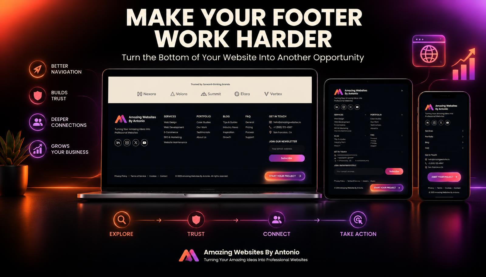
A well-designed footer can help visitors find important information, explore more of your website, build trust in your business, and decide what to do next.
Think of your footer as one final opportunity to help your visitor.
Here are some ways to make it work harder for your business.
1. Give Your Footer a Purpose
Before adding information to your footer, ask:
What should visitors be able to accomplish here?
Your footer might help them:
- Navigate your website
- Find your contact information
- Explore your services
- Read your blog
- Visit your social media pages
- Find answers to questions
- Review important policies
- Start a project
- Contact your business
Every item should have a reason for being there.
2. Include Important Navigation Links
Your footer can act as a second navigation system.
Visitors who reach the bottom of a page shouldn't have to scroll all the way back to the top just to find another section.
Consider including links such as:
- Home
- About
- Services
- Portfolio
- Testimonials
- Blog
- FAQ
- Contact
This gives visitors another easy way to continue exploring.
3. Organize Links Into Categories
If your website contains many pages, don't create one giant list.
Group links into categories.
For example:
Explore
- Home
- About
- Portfolio
- Testimonials
Services
- Website Design
- Branding
- AI Solutions
- Automation
Resources
- Blog
- FAQ
- Helpful Guides
Contact
- Contact Page
- Social Media
Clear organization makes a larger footer easier to understand.
4. Include Your Brand Identity
Your footer should feel like part of your website—not something added at the last minute.
Consider including:
- Your logo
- Business name
- Brand colors
- Short business description
- Tagline
Keep the design consistent with the rest of your website.
Consistency strengthens your overall brand experience.
5. Include a Short Brand Message
You don't need another full About section in the footer.
A short statement can remind visitors what your business does.
For example:
"Amazing Websites By Antonio creates professional websites, branding, AI-powered solutions, automation, and digital experiences designed to help businesses strengthen their online presence."
Keep it short, clear, and useful.
6. Make Contact Information Easy to Find
Visitors often scroll to the footer specifically looking for contact information.
Depending on your business, you might include:
- Email address
- Phone number
- Contact-page link
- Business location or service area when relevant
- Contact button
Make sure the information is current.
7. Add a Strong Call to Action
The visitor has reached the bottom of the page.
What should happen next?
Give them an option.
For example:
HAVE AN AMAZING IDEA?
Let's turn it into something professional.
START YOUR PROJECT →
Other calls to action might include:
- Contact Us
- Request a Quote
- View Our Services
- Explore Our Work
The footer can become one final invitation to take action.
8. Connect Your Social Media
If social media is part of your business strategy, the footer can be a good place for social icons.
Link only to profiles you actively use and want customers to visit.
Always test the links.
A social icon that leads to the wrong profile or a broken page can create unnecessary frustration.
9. Include Important Legal Links
Depending on your website and business, the footer may contain links such as:
- Privacy Policy
- Terms and Conditions
- Accessibility information
- Cookie information
The specific legal requirements depend on your business, location, audience, and how your website collects or uses information.
Don't copy another company's legal policies without understanding whether they apply to your business.
10. Include Copyright Information
Many business websites include a copyright line in the footer.
For example:
© 2026 Amazing Websites By Antonio. All Rights Reserved.
Keep the year current when appropriate.
11. Consider a Newsletter Signup
If email marketing is part of your strategy, your footer can provide an opportunity for visitors to subscribe.
Keep the form simple.
For example:
GET HELPFUL WEBSITE & BUSINESS TIPS
Email Address
SUBSCRIBE →
Clearly explain what subscribers can expect.
Never make people wonder what they are signing up for.
12. Link to Your Latest Content
Your footer can help visitors discover useful resources.
You might include:
LATEST FROM THE BLOG
- Latest Article
- Popular Article
- View All Blogs
This can help keep visitors engaged after they finish reading a page.
13. Don't Overload the Footer
A footer can contain a lot of information.
That doesn't mean it should contain everything.
Avoid turning it into a cluttered wall of links.
Use:
- Clear columns
- Strong headings
- Consistent spacing
- Short text
- Simple icons
- Visual hierarchy
The footer should feel organized.
14. Design It for Mobile Devices
Large desktop footers often use several columns.
On mobile devices, those columns usually need to stack vertically.
Make sure:
- Text remains readable
- Links are easy to tap
- Social icons are spaced properly
- Forms fit the screen
- Nothing overlaps
- Sections remain organized
Test your footer at multiple screen sizes.
15. Check Footer Links Regularly
Because the footer often appears across the entire website, one broken footer link can appear on many pages.
Regularly test:
- Navigation links
- Contact links
- Email links
- Social media links
- Legal pages
- Blog links
- Calls to action
Fix broken or outdated links as soon as possible.
16. Don't Hide Important Information
Some businesses place important information only in the footer.
Be careful.
If something is essential to the customer journey, it may also deserve a more visible location elsewhere on the website.
The footer should support the website—not hide information visitors need.
17. Keep the Design Consistent
Your footer should match your brand.
Use consistent:
- Typography
- Colors
- Button styles
- Icon styles
- Spacing
- Tone of voice
The visitor should feel like they're still on the same website.
18. Give Visitors a Way Forward
The most important principle is simple:
Don't let the bottom of the page become the end of the experience.
Someone who reaches the footer may still want to:
Learn more. Read another article. Explore a service. View your work. Contact you. Start a project.
Give them somewhere meaningful to go.
19. Think of the Footer as a Safety Net
Visitors don't always follow the journey you planned.
Someone might skip your navigation. Another person might scroll quickly through the page. Someone else might reach the bottom while still looking for an answer.
Your footer can act as a safety net.
It can collect the most useful destinations and provide another opportunity for visitors to find what they need.
20. Turn the Bottom of Your Website Into an Opportunity
The footer is technically the bottom of the page.
But strategically, it doesn't have to be the end.
It can become:
- Another navigation point.
- Another trust-building opportunity.
- Another connection to your brand.
- Another useful resource.
- Another invitation to contact you.
- Another step in the customer journey.
Final Thoughts
Your website footer deserves more attention than a copyright notice and a few random links.
When designed with purpose, it can support your entire website.
It can improve navigation. It can strengthen your branding. It can make contact information easier to find. It can connect visitors with resources. And it can provide one final clear call to action.
So when you're building or reviewing your website, don't stop at the bottom.
Ask: "What does my visitor need next?"
Then let your footer provide the answer.
Because the end of the page doesn't have to be the end of the journey.
Amazing Websites By Antonio
Turning Your Amazing Ideas Into Professional Websites