Imagine walking into a store where nothing is labeled.
You don't know where the products are.
You don't know where to ask for help.
You don't know where to check out.
You might leave.
A website can create the same frustration when its navigation is confusing.
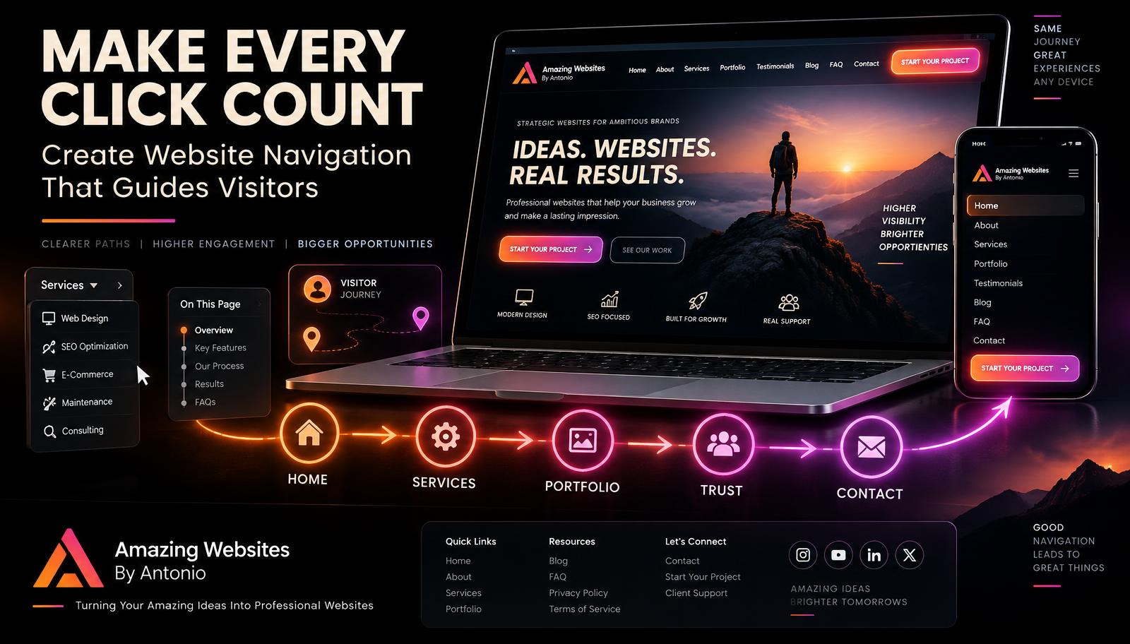
Your website navigation acts like a map.
It helps visitors understand where they are, where they can go, and how to find the information they need.
Great navigation shouldn't make people think: “Where am I supposed to click?”
It should make the next step feel natural.
Here are some ways to create website navigation that helps visitors find what they need faster.
1. Keep Your Main Menu Clear
Your main navigation should focus on the destinations that matter most.
For many business websites, that might include:
- Home
- About
- Services
- Portfolio
- Testimonials
- Blog
- FAQ
- Contact
Your business may need different pages, but the principle remains the same:
Make the important destinations easy to find.
2. Use Words People Understand
Creative menu names can sound interesting, but they can also confuse visitors.
If someone is looking for your services, a menu item labeled “Services” is immediately understandable.
If it is called something mysterious like “Discover the Possibilities,” visitors may not know what they will find.
Creativity has a place in website design.
Navigation is usually a place where clarity should come first.
3. Don't Overload the Menu
Putting every page in the main navigation can create too many choices.
Ask:
- Which pages do most visitors need?
- Which pages support the customer journey?
- Which pages belong underneath a larger category?
Less-important pages can often be placed in dropdown menus or the footer.
4. Group Related Pages Together
If your website has many pages, organize them into logical groups.
For example:
SERVICES
→ Website Design
→ Branding
→ AI Solutions
→ Automation
RESOURCES
→ Blog
→ FAQ
→ Guides
ABOUT
→ Our Story
→ Credentials
→ Testimonials
Grouping related information helps keep the main navigation organized.
5. Create a Clear Visual Hierarchy
Visitors should be able to quickly distinguish the navigation from the rest of the page.
Use consistent:
- Typography
- Spacing
- Button styles
- Hover effects
- Dropdown styles
- Alignment
The navigation should feel like a natural part of your website's design.
6. Make Your Primary Call to Action Stand Out
If there is one action you especially want visitors to take, consider giving it greater visual emphasis.
For example:
- START YOUR PROJECT
- REQUEST A QUOTE
- BOOK A CONSULTATION
- CONTACT US
This button can appear separately from standard navigation links.
The goal is not to pressure visitors.
It is to make the next step easy to recognize.
7. Make Your Logo Clickable
Many visitors expect a website logo to take them back to the homepage.
Making your logo clickable gives users a familiar way to return to the beginning of the site.
It's a small detail that can make navigation feel more intuitive.
8. Use Dropdown Menus Carefully
Dropdown menus can be useful when a website has many related pages.
But avoid creating endless layers of menus.
A visitor shouldn't have to navigate:
Menu → Dropdown → Submenu → Another Submenu → Page
Keep the structure as simple as possible.
9. Consider a Sticky Header
A sticky header stays visible as visitors scroll down a page.
This can make navigation easier on long pages because visitors don't have to scroll all the way back to the top.
If you use one, make sure it doesn't take up too much screen space.
The navigation should help—not block—the content.
10. Make Mobile Navigation Easy
Desktop navigation and mobile navigation often need different layouts.
On mobile devices, menus are commonly placed inside a menu button.
Make sure:
- The menu opens easily
- Links are large enough to tap
- Dropdowns work properly
- The menu can be closed easily
- Important calls to action remain accessible
- Nothing extends off the screen
Always test the menu on an actual mobile-sized screen.
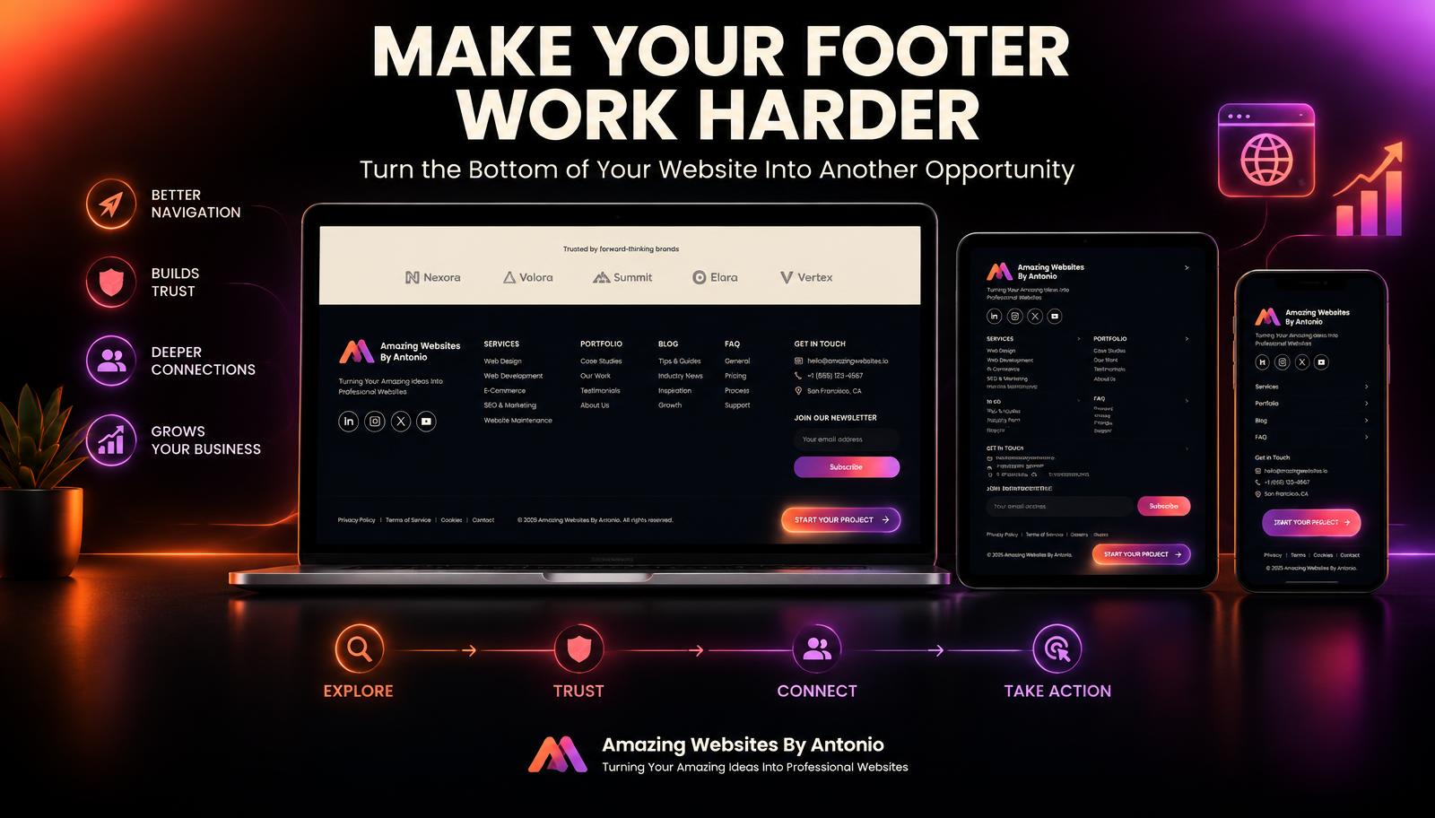
11. Use the Footer as Secondary Navigation
Your footer is another important navigation area.
It can include links to:
- About
- Services
- Portfolio
- Blog
- FAQ
- Contact
- Privacy Policy
- Terms
- Social media
This gives visitors another way to navigate after reaching the bottom of a page.
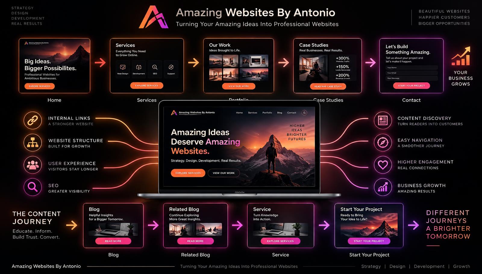
12. Use Internal Links Throughout Your Content
Navigation isn't limited to the header and footer.
Your pages can guide visitors through internal links.
For example:
- A Services page can link to your Portfolio.
- A Portfolio project can link to a Case Study.
- A Case Study can link to Contact.
- A Blog post can link to a related service.
- An About page can link to your Founder's Letter.
These connections create pathways through your website.
13. Use Breadcrumbs on Larger Websites
For websites with many levels of content, breadcrumbs can help visitors understand where they are.
For example:
Home → Resources → Blog → Website Navigation
Breadcrumbs can also provide an easy way to move back to a larger category.
They aren't necessary for every website, but they can be helpful for complex sites.
14. Don't Create Dead Ends
Every important page should give visitors somewhere useful to go next.
At the bottom of a blog post:
READ ANOTHER ARTICLE →
On a portfolio project:
VIEW THE CASE STUDY →
On a service page:
START YOUR PROJECT →
On your About page:
EXPLORE OUR SERVICES →
A visitor shouldn't reach the end of a page and have no idea what to do.
15. Check for Broken Links
Even beautifully designed navigation becomes frustrating when links don't work.
Regularly check:
- Menu links
- Footer links
- Buttons
- Internal links
- Social links
- Contact links
- Portfolio links
Fix or remove broken links quickly.
16. Make the Current Page Clear
Visitors should have some indication of where they are.
Your navigation might highlight the active page.
For example, if someone is reading the Blog, the Blog navigation item can appear visually active.
Small details like this improve orientation.
17. Test Your Navigation With Someone Else
You already know your website.
That can make it difficult to notice confusing navigation.
Ask someone unfamiliar with the site to complete simple tasks:
- “Find my services.”
- “Find a portfolio project.”
- “Find the contact page.”
- “Find my latest blog.”
Watch how easily they complete each task.
If they struggle, the navigation may need improvement.
18. Review Your Navigation as Your Website Grows
A navigation system that worked when your website had six pages may not work when it has 30.
As your website grows:
- Reorganize categories
- Remove unnecessary links
- Update page names
- Improve dropdowns
- Check mobile navigation
- Update footer links
Your navigation should evolve with your business.
19. Think Like Your Visitor
One of the most important questions you can ask is:
“If I had never visited this website before, would I know where to go?”
Don't organize your navigation only around how you think about your business.
Organize it around what your visitors are trying to accomplish.
They may want to:
- Learn about you.
- Understand your services.
- See your work.
- Read reviews.
- Get answers.
- Contact you.
Make those paths easy to find.
20. Simple Navigation Can Be Powerful
Navigation doesn't have to be flashy to be effective.
In fact, visitors may barely notice excellent navigation.
That's often a good thing.
They simply find what they need and keep moving.
The navigation disappears into the experience.
Final Thoughts
Your website can contain amazing content, beautiful designs, helpful resources, and powerful services.
But those things lose value if visitors can't find them.
Good navigation creates direction.
It reduces confusion.
It connects your pages.
It supports your customer journey.
And it helps visitors move from curiosity to action.
Don't make visitors hunt for information.
Give them a map.
Make the destination clear.
And make every click feel like a natural next step.
Amazing Websites By Antonio
Turning Your Amazing Ideas Into Professional Websites