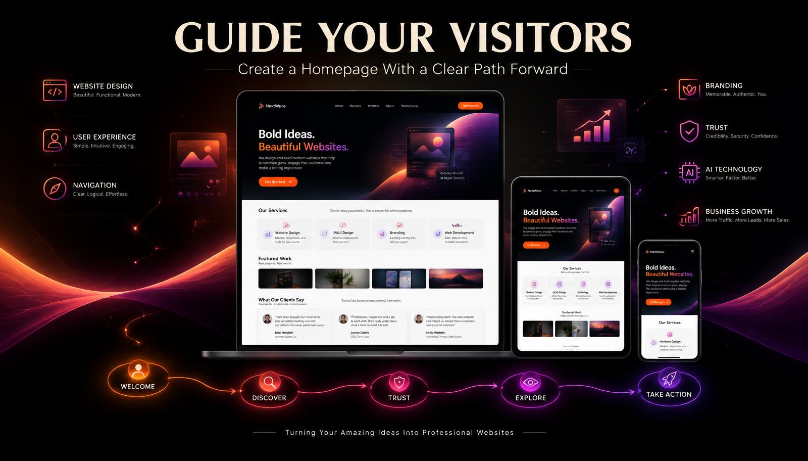
Your homepage is often one of the first places people experience your business online.
Within a short amount of time, visitors may be asking:
- What does this business do?
- Is this for me?
- Can I trust them?
- Where should I go next?
A strong homepage helps answer those questions without overwhelming the visitor.
The goal isn''t to put every piece of information about your business on one page.
The goal is to guide people.
Here are some ways to create a homepage that gives visitors a clear path forward.
1. Start With a Clear Hero Section
The top of your homepage is valuable space.
Visitors should quickly understand what your business does.
A strong hero section usually includes:
- A clear headline
- A short supporting statement
- A primary call-to-action button
- A strong visual
- Your brand identity
Avoid filling this area with too many messages.
Give visitors one clear introduction.
2. Explain What You Do
Don''t make visitors search your website to figure out what your business provides.
Use simple language.
A visitor should be able to understand:
- What you do
- Who you help
- Why it matters
- What they can do next
Clarity builds confidence.
Confusion creates exits.
3. Create a Visual Hierarchy
Not everything on your homepage should demand the same amount of attention.
Your design should guide the eye.
Use:
- Strong headlines
- Clear sections
- Consistent typography
- White space
- Visual contrast
- Buttons
- Images
- Short paragraphs
The most important information should be easiest to notice.
4. Don''t Put Everything Above the Fold
You don''t need to squeeze your entire business into the first screen.
The hero section should create enough interest for visitors to continue.
Then the rest of the homepage can tell the story step by step.
Think of your homepage as a guided journey rather than a giant advertisement.
5. Introduce Your Services
Visitors need an easy way to understand what you offer.
Instead of explaining every detail, provide a simple overview of your primary services.
For example:
- Website Design — Professional websites designed around your business, goals, and customers.
- Branding — Creative visual solutions that help businesses build a recognizable identity.
- AI Solutions — AI-powered tools and strategies designed to improve digital experiences and business processes.
- Automation — Solutions that can help simplify repetitive tasks and improve workflows.
Then provide a button such as:
Explore Our Services →
6. Show Your Best Work
Your homepage can provide a preview of your portfolio.
Choose a few strong projects.
Use high-quality images or website mockups.
Then invite visitors to explore more:
View Our Portfolio →
You don''t need to show every project on the homepage.
Give visitors a taste of your work and provide a path to the full collection.
7. Build Trust Early
Don''t wait until the bottom of your website to establish credibility.
Your homepage can include trust-building elements such as:
- Customer testimonials
- Credentials
- Certifications
- Portfolio projects
- Case studies
- Business milestones
- Professional experience
- Publications
Use only information that is accurate and relevant.
Trust should be earned through evidence.
8. Include Your Story — But Keep It Short
People may want to know who is behind the business.
Your homepage can include a short founder introduction.
Explain:
- Who you are.
- Why the business exists.
- What you believe in.
- How you help customers.
Then provide a link:
Read Our Story →
Your full story can live on your About page or Founder''s Letter.
9. Use Calls to Action With Purpose
Too many competing buttons can create confusion.
Choose calls to action based on what you want visitors to do.
Examples include:
- Start Your Project
- View Our Work
- Explore Services
- Contact Us
- Read Our Story
- Learn More
The primary action should be visually stronger than secondary actions.
10. Create a Natural Customer Journey
Think about the order in which visitors receive information.
A homepage might follow this journey:
Hero ↓ What We Do ↓ Services ↓ Why Choose Us ↓ Featured Work ↓ Case Study ↓ Testimonials ↓ Our Story ↓ Final Call to Action
Each section answers another question and encourages the visitor to keep moving.
11. Keep Text Easy to Scan
Many visitors won''t read every word.
They scan.
Help them by using:
- Short paragraphs
- Descriptive headings
- Bullet points
- Clear buttons
- Visual breaks
- Highlighted information
Visitors should understand the basic message even when scanning quickly.
12. Use Visuals With a Purpose
Images should support the message.
Instead of adding graphics simply because there is empty space, ask:
- What does this image communicate?
- Does it show the service?
- Does it demonstrate the work?
- Does it strengthen the brand?
- Does it help explain something?
Good visuals should contribute to the customer experience.
13. Design for Mobile First
Your homepage may look beautiful on a large computer screen.
But what happens when someone opens it on a phone?
Check:
- Headline size
- Button size
- Image scaling
- Navigation
- Spacing
- Forms
- Service cards
- Portfolio sections
- Loading speed
Mobile visitors deserve the same professional experience.
14. Don''t Overuse Animations
Animations can make a website feel modern and engaging.
But too many moving elements can become distracting.
Use motion intentionally.
A subtle transition or hover effect can support the experience.
Constant movement can compete with the information visitors are trying to understand.
Design should guide attention, not fight for it.
15. Make Your Navigation Simple
Your homepage and navigation work together.
Visitors should easily find important destinations such as:
- About
- Services
- Portfolio
- Testimonials
- Blog
- FAQ
- Contact
If your website has many sections, organize them logically.
Visitors should not need to solve a puzzle to find information.
16. Give Visitors More Than One Opportunity to Take Action
Some visitors may be ready to contact you immediately.
Others may need to explore first.
That''s why your homepage can include calls to action at different stages.
At the top:
Start Your Project
After services:
Explore Services
After portfolio:
View Our Work
At the bottom:
Let''s Build Something Amazing
The actions should feel natural within the visitor''s journey.
17. End With a Strong Final Section
The bottom of your homepage is another opportunity.
Don''t let the page simply stop.
Finish with a clear message.
For example:
Have an amazing idea?
Your next website, brand, AI-powered solution, or digital project can start with a conversation.
Turn your amazing idea into something professional.
Start Your Project →
This gives visitors one final clear direction.
18. Review Your Homepage Regularly
Your business will continue to grow.
Your homepage should grow with it.
Periodically review:
- Services
- Portfolio projects
- Testimonials
- Calls to action
- Contact information
- Links
- Images
- Messaging
- Mobile layout
Remove outdated information and add stronger examples as your business develops.
19. Remember the Purpose of Your Homepage
Your homepage doesn''t have to tell visitors everything.
It needs to help them understand enough to continue.
Think of it as the front door of your digital business.
Welcome people.
Tell them where they are.
Show them what you can offer.
Build confidence.
Then guide them toward the next room.
Final Thoughts
A successful homepage isn''t necessarily the homepage with the most information.
It''s the one that makes information easiest to understand.
Every section should have a purpose.
Every button should lead somewhere meaningful.
Every image should support the message.
And every part of the page should help visitors move forward.
Don''t overwhelm visitors with everything at once.
Guide them.
Help them discover your services.
Show them your work.
Build their confidence.
Give them a clear next step.
Because a great homepage doesn''t simply say:
“Welcome to our website.”
It says:
“Welcome. Here''s how we can help.”
Amazing Websites By Antonio
Turning Your Amazing Ideas Into Professional Websites