Imagine visiting a website and discovering that the text is difficult to read.
The buttons are hard to find.
Videos don't have captions.
Images contain important information that isn't explained in text.
Or perhaps you can't navigate the website without using a mouse.
For some visitors, these aren't minor inconveniences.
They can become real barriers.
That's why website accessibility matters.
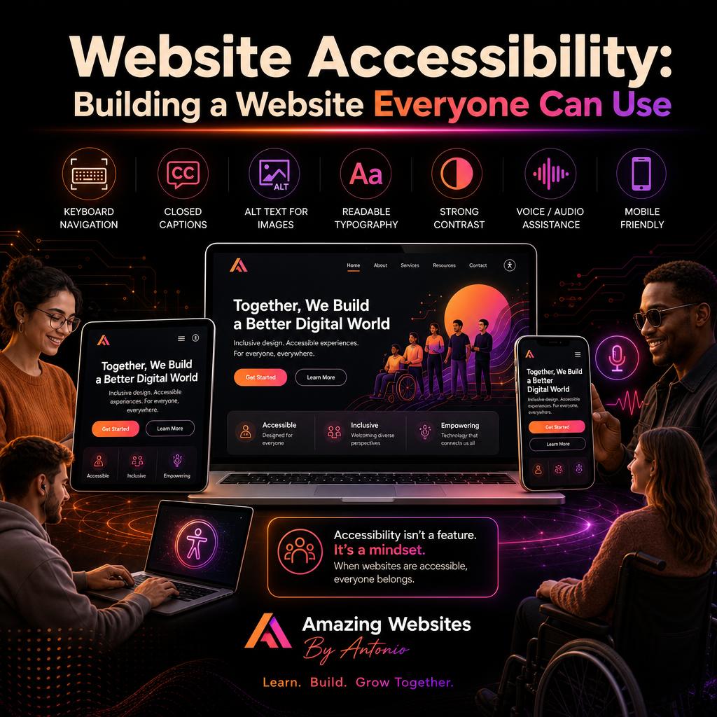
An accessible website is designed so that more people—including people with disabilities—can access information, navigate pages, understand content, and interact with important features.
Accessibility isn't simply about checking boxes.
It's about creating a better digital experience for people.
Let's look at practical ways businesses can make their websites more accessible.
1. Start With Clear, Readable Text
Beautiful typography shouldn't come at the expense of readability.
Visitors should be able to comfortably read your website without struggling to understand tiny or overly decorative text.
Consider:
- Using readable font sizes
- Choosing clear fonts for body text
- Providing comfortable spacing
- Breaking long paragraphs into smaller sections
- Using descriptive headings
Your content should invite people to read—not make them work to understand it.
2. Use Strong Color Contrast
Your brand colors are important, but the text still needs to be easy to see against the background.
For example, light-gray text on a white background may look stylish but can be difficult for some people to read.
Make sure important text and interactive elements have sufficient contrast.
This is especially important for:
- Buttons
- Navigation
- Form labels
- Links
- Body text
Good design and accessibility can work together.
You don't have to sacrifice your brand identity to make your website easier to use.
3. Add Alternative Text to Important Images
Images can communicate important information.
But someone using a screen reader may not experience an image visually.
Alternative text—often called alt text—provides a written description when an image conveys meaningful information.
For example, instead of an image simply being identified as:
“image123.jpg”
Useful alt text might describe its purpose:
“Business owner reviewing website analytics on a laptop.”
Alt text should communicate the useful meaning of the image rather than stuffing it with unnecessary keywords.
Decorative images may be handled differently so they don't create extra noise for assistive technology.
4. Make Your Website Keyboard-Friendly
Not everyone navigates a website using a mouse.
Some visitors rely on keyboards or other assistive technology.
Try navigating your own website using only your keyboard.
Can you:
- Move through the navigation?
- Reach important links?
- Select buttons?
- Complete forms?
- See which element currently has focus?
If you become trapped or can't tell where you are, that's a sign the experience needs attention.
5. Use Descriptive Link Text
Consider a page filled with links that all say:
“Click here.”
Without surrounding context, that doesn't tell a visitor where the link goes.
Instead, use descriptive language such as:
“Explore our website design services.”
or:
“Read our beginner's guide to SEO.”
Descriptive links help everyone understand what will happen before they select them.
6. Add Captions to Video Content
Video can be a powerful way to educate and connect with visitors.
But spoken information shouldn't only be available through audio.
Captions can help:
- People who are deaf or hard of hearing
- Visitors in noisy environments
- People watching without sound
- People who benefit from reading along
For important audio-only material, transcripts can also make information available in another format.
Accessibility often benefits more people than we initially realize.
7. Don't Communicate Important Information With Color Alone
Imagine a form that displays incorrect answers only by turning the field red.
Someone who has difficulty distinguishing colors may not understand what happened.
Instead, combine color with:
- Text
- Symbols
- Labels
- Clear instructions
For example:
“Please enter a valid email address.”
Now the message doesn't depend on color alone.
8. Make Forms Easier to Understand
Contact forms are an important part of many business websites.
Each field should have a clear label.
Instead of relying only on placeholder text inside a box, clearly identify what information is required.
For example:
- Name
- Email Address
- Business Name
- Tell Us About Your Project
If something goes wrong, provide a helpful error message explaining how to fix it.
Accessible forms benefit everyone.
9. Create Clear Page Structure
Headings aren't only visual decorations.
They help organize information.
A page should have a logical structure.
For example:
- Main Page Title
- Then major sections.
- Then subsections within those sections.
Logical organization helps visitors scan content and can also help people using assistive technology understand how the page is arranged.
10. Be Careful With Animations
Animations can make websites feel modern and interactive.
But excessive movement can also create problems.
Avoid unnecessary flashing content, and consider whether visitors can pause or reduce significant motion where appropriate.
Ask yourself:
“Does this animation help visitors accomplish something?”
If it doesn't, you may not need it.
Great design isn't about adding the most effects.
It's about adding the right effects.
11. Make Buttons Easy to Understand
Buttons should clearly explain what they do.
Instead of:
GO
Consider:
- Send My Message
- View My Portfolio
- Start My Project
- Explore AI Resources
Clear calls to action help visitors understand what happens next.
Buttons should also be large enough to interact with comfortably, particularly on mobile devices.
12. Remember Mobile Accessibility
Accessibility and responsive design work together.
Check your website on smaller screens.
Look at:
- Text size
- Button spacing
- Forms
- Menus
- Images
- Pop-ups
- Videos
A feature that's easy to use on a desktop may become difficult on a smartphone.
Test both.
Accessibility Is an Ongoing Process
A common mistake is treating accessibility as something you complete once and never revisit.
Websites change.
New blog articles are published.
New images are uploaded.
New features are added.
That's why accessibility should become part of your regular website workflow.
Whenever you publish something new, ask:
- Can people read it?
- Can people navigate it?
- Can people understand it?
- Can people interact with it?
Those questions can guide better decisions.
AI Can Help—But Don't Depend on AI Alone
AI-powered tools can assist with parts of accessibility work.
For example, technology may help identify potential:
- Missing alt text
- Contrast issues
- Content problems
- Form issues
- Structural concerns
But automated tools cannot guarantee that a website is fully accessible.
Human testing still matters.
Whenever possible, combine automated checks with manual testing and feedback from real users.
AI should support the process—not replace thoughtful design.
Accessibility and Great Design Belong Together
Some people mistakenly believe accessible websites have to be boring.
They don't.
A website can be:
- Bold.
- Creative.
- Modern.
- Interactive.
- Beautiful.
And still be designed with accessibility in mind.
In fact, many accessibility practices improve usability for everyone.
Clear navigation helps everyone.
Readable text helps everyone.
Captions help more than one audience.
Logical forms help everyone.
Accessibility isn't separate from good design.
It's part of good design.
Final Thoughts
Every visitor deserves a meaningful opportunity to access your website.
When businesses think about accessibility from the beginning, they create digital experiences that can reach more people.
Start with practical improvements:
- Use readable text.
- Provide sufficient contrast.
- Add useful alt text.
- Create keyboard-friendly navigation.
- Caption videos.
- Label forms.
- Write descriptive links.
- Test your website regularly.
You may not perfect everything overnight.
What's important is continuing to learn, test, and improve.
The internet should create opportunities—not unnecessary barriers.
And every website we build is an opportunity to make the digital world a little more inclusive.
⭐ Antonio's Pro Tip
Try navigating your homepage without touching your mouse.
Use your keyboard and move through the page.
Then ask yourself:
“Can I clearly tell where I am, what I can select, and how to reach the most important parts of my website?”
It's a simple test that can reveal usability problems you may never notice when using a mouse.
Then test the same page on your smartphone.
Accessibility begins by experiencing your website from more than one perspective.
🚀 Let's Build Digital Experiences for More People
At Amazing Websites By Antonio, I believe professional websites should combine creativity, technology, accessibility, and thoughtful user experiences.
A website shouldn't only look impressive.
It should help people.
Through professional website design, AI-powered branding, and creative digital solutions, my goal is to help businesses build online experiences that are useful, engaging, and welcoming.
Technology is most powerful when more people can benefit from it.
Let's build something amazing together.
Turning Your Amazing Ideas Into Professional Websites
Amazing Websites By Antonio
Creating Professional Websites, AI Solutions, and Digital Experiences That Help Businesses Thrive.