Imagine someone visits your website.
They like your design.
They read about your services.
They explore your portfolio.
They even read several of your blog articles.
Then they leave.
No message.
No consultation.
No quote request.
No purchase.
What happened?
Sometimes the problem isn't your website, your service, or even your content.
The visitor simply wasn't given a clear enough next step.
That's where a strong call to action comes in.
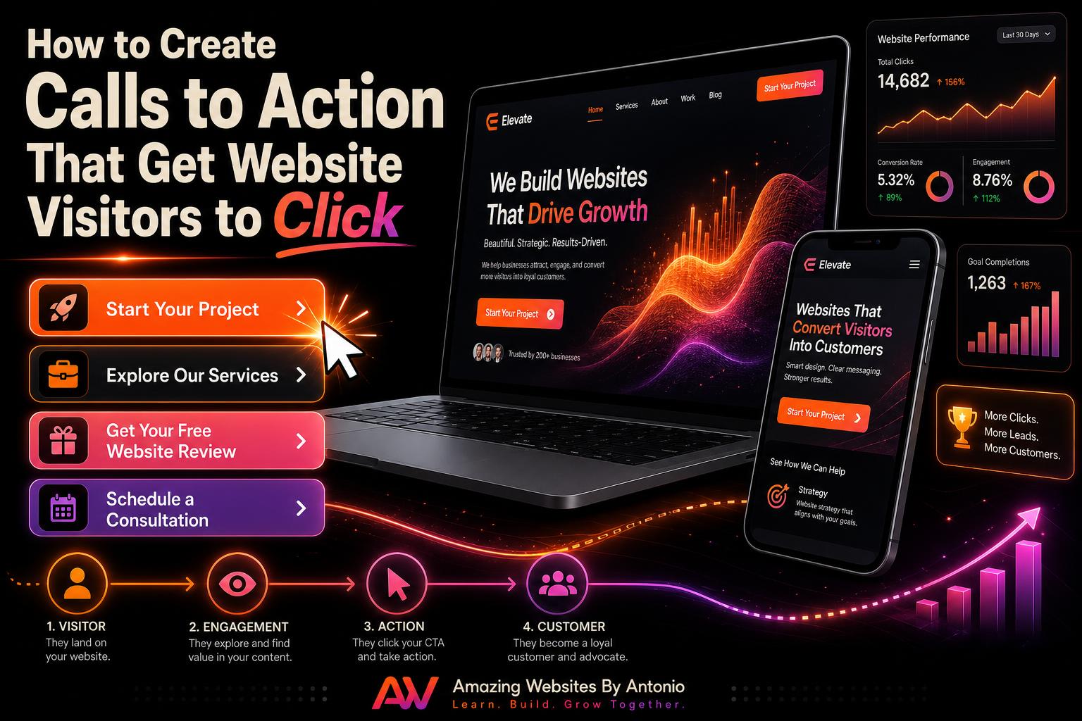
A call to action—often shortened to CTA—helps guide visitors toward what you want them to do next.
Let's explore how to create calls to action that are clear, helpful, and more likely to encourage visitors to take that next step.
What Is a Call to Action?
A call to action is a message that encourages someone to take a specific action.
You've probably seen CTAs such as:
- Contact Us
- Learn More
- Buy Now
- Schedule a Consultation
- Download the Guide
- Join Our Newsletter
- Start Your Project
CTAs may appear as buttons, links, banners, forms, or text.
Their purpose is simple:
Help visitors understand what they should do next.
Why Calls to Action Matter
Imagine walking into a large store with no signs.
You don't know where anything is.
Nobody offers assistance.
Eventually, you may leave.
Websites can create the same problem.
Visitors need direction.
A CTA provides that direction.
Instead of making someone wonder:
“What do I do now?”
you're telling them:
“Here's the next step.”
1. Make Your CTA Specific
Generic CTAs aren't always bad, but more specific language can provide greater clarity.
Instead of:
Click Here
Try:
View Our Website Services
Instead of:
Submit
Try:
Send My Project Request
Instead of:
Learn More
Try:
Explore the AI Learning Hub
The visitor should understand what will happen before clicking.
2. Focus on What the Visitor Gets
Strong CTAs often communicate value.
Compare:
Join Newsletter
with:
Get Monthly Website & AI Tips
The second version explains why someone might want to join.
Another example:
Instead of:
Download
try:
Download Your Free Website Checklist
The more clearly visitors understand the benefit, the easier it becomes for them to decide whether to take action.
3. Use Action-Oriented Language
Your CTA should encourage movement.
Useful action words include:
- Start
- Explore
- Discover
- Download
- Schedule
- Join
- Build
- Create
- Get
- View
For example:
- Start Your Website Project
- Explore Our Services
- Discover AI Resources
- Get Your Free Guide
Clear language creates momentum.
4. Make Important Buttons Easy to See
A CTA shouldn't disappear into the rest of the page.
Use thoughtful:
- Color contrast
- Button size
- White space
- Placement
- Typography
Visitors should be able to quickly recognize interactive elements.
But don't make every button scream for attention.
If everything is emphasized, nothing feels important.
Choose a clear visual hierarchy.
5. Give Each Page a Primary Goal
One of the biggest CTA mistakes is asking visitors to do too many things at once.
Imagine seeing:
BUY NOW! JOIN TODAY! CALL US! DOWNLOAD THIS! FOLLOW US! READ THIS!
all within the same section.
That's overwhelming.
Instead, ask:
“What is the most important action I want someone to take on this page?”
Make that your primary CTA.
Other actions can remain available, but they shouldn't compete with the main goal.
6. Place CTAs Where They Make Sense
You don't necessarily need to wait until the bottom of a page.
Consider placing CTAs:
- Near the top of important pages
- After explaining a service
- Following testimonials
- After portfolio examples
- Inside relevant blog content
- Near the bottom of the page
The CTA should appear when the visitor has enough information to understand why taking action makes sense.
7. Connect the CTA to the Content
Your CTA should match what the visitor is reading.
For example, after an article about SEO:
Get Help Improving Your Website's SEO
After an article about website redesign:
Request a Website Review
After an AI article:
Explore More AI Resources
Relevant CTAs feel like a natural continuation of the visitor's journey rather than an interruption.
8. Reduce Uncertainty
Sometimes visitors don't click because they're unsure what happens next.
Imagine a button that says:
Get Started
What does that mean?
Will they be charged?
Will they receive a phone call?
Will they complete a form?
You can reduce uncertainty with supporting text.
For example:
Schedule a Free Introductory Conversation
Tell us about your project and we'll discuss possible next steps.
Now the visitor has more context.
9. Build Trust Near Important CTAs
Before asking someone to contact you or make a purchase, provide reasons to feel confident.
Near your CTA, you might include:
- Customer testimonials
- Portfolio examples
- Certifications
- Clear process information
- FAQs
- Privacy information
Trust reduces hesitation.
The CTA then becomes the natural next step.
10. Don't Forget Mobile Visitors
A CTA that looks great on desktop may not work well on a smartphone.
Check whether buttons are:
- Large enough to tap comfortably
- Clearly visible
- Properly spaced
- Easy to understand
- Positioned appropriately
Also make sure pop-ups or other elements aren't covering important buttons.
Test your CTA on a real phone—not just your desktop preview.
11. Use CTAs Inside Your Blog
Your blog shouldn't necessarily end with the final sentence of an article.
Help readers continue their journey.
You might invite them to:
- Read another related article
- Explore your services
- Visit your learning resources
- Download a checklist
- Contact your business
A helpful blog article can become the beginning of a customer relationship.
12. Don't Ask for Too Much Too Soon
Imagine someone discovering your business for the first time.
They've read one paragraph.
Then they're immediately asked to:
BUY NOW!
That may be too much too soon.
Different visitors are at different stages.
Some may be ready to purchase.
Others may only be ready to learn.
That's why your website can provide different paths.
For someone researching:
Explore Our Resources
For someone considering your services:
View Our Portfolio
For someone ready to act:
Start Your Project
Meet visitors where they are.
13. Test Different CTA Language
Sometimes small wording changes can make a difference.
You might compare:
Contact Us
with:
Tell Us About Your Project
Or:
Learn More
with:
Explore Website Design Services
Monitor how visitors respond.
Don't assume the first version you create is automatically the best.
Great websites continue improving.
Your CTA Should Feel Like Help, Not Pressure
This is important.
A CTA shouldn't make visitors feel forced.
It should make their journey easier.
Think of it as saying:
“If this information helped you, here's what you can do next.”
That's very different from:
“BUY SOMETHING RIGHT NOW!”
Good calls to action guide.
They don't pressure.
Create a Customer Journey
Your website should tell a story.
A visitor may:
Discover your website.
↓
Learn about your business.
↓
Read helpful content.
↓
Explore your work.
↓
Build trust.
↓
Take action.
Your CTAs connect those stages.
Without them, visitors can reach the end of a page and have nowhere obvious to go.
Final Thoughts
A beautiful website attracts attention.
Helpful content builds trust.
But clear calls to action help turn that attention and trust into movement.
Every important page should answer:
“What should the visitor do next?”
Make the answer clear.
Make it relevant.
Make it easy.
And make sure the action genuinely helps move the visitor toward their goal.
Sometimes improving conversions doesn't require rebuilding an entire website.
Sometimes it starts by changing one button from:
“Submit”
to:
“Let's Start My Project.”
Small changes can create a much clearer experience.
⭐ Antonio's Pro Tip
Go through your website one page at a time and identify the primary CTA on every page.
If you can't find one within a few seconds, your visitors may not be able to either.
Then ask:
“Does this CTA clearly tell visitors what they'll get or what happens next?”
If not, rewrite it.
Clarity beats cleverness.
🚀 What Should Your Visitors Do Next?
At Amazing Websites By Antonio, I believe professional websites shouldn't leave visitors wondering where to go.
From professional website design and AI-powered branding to creative digital solutions, every part of the experience should help guide people toward useful information and meaningful action.
Your website has already captured their attention.
Now give them a clear path forward.
Ready to create an online experience that works harder for your business?
Let's build something amazing together.
Turning Your Amazing Ideas Into Professional Websites
Amazing Websites By Antonio
Creating Professional Websites, AI Solutions, and Digital Experiences That Help Businesses Thrive.