How to Simplify Your Website Without Losing Important Information
Your website can hold a lot of valuable content and still feel simple. Learn how to organize information, create clear hierarchy, and guide visitors—without deleting what matters.
Your business has a lot to say.
You want visitors to understand your services. You want to tell your story. You want to showcase your work. You want to answer questions. You want to explain your process. You want to share helpful resources.
And before long, your website can become packed with information.
The problem isn't always having too much information. Sometimes the problem is how that information is organized.
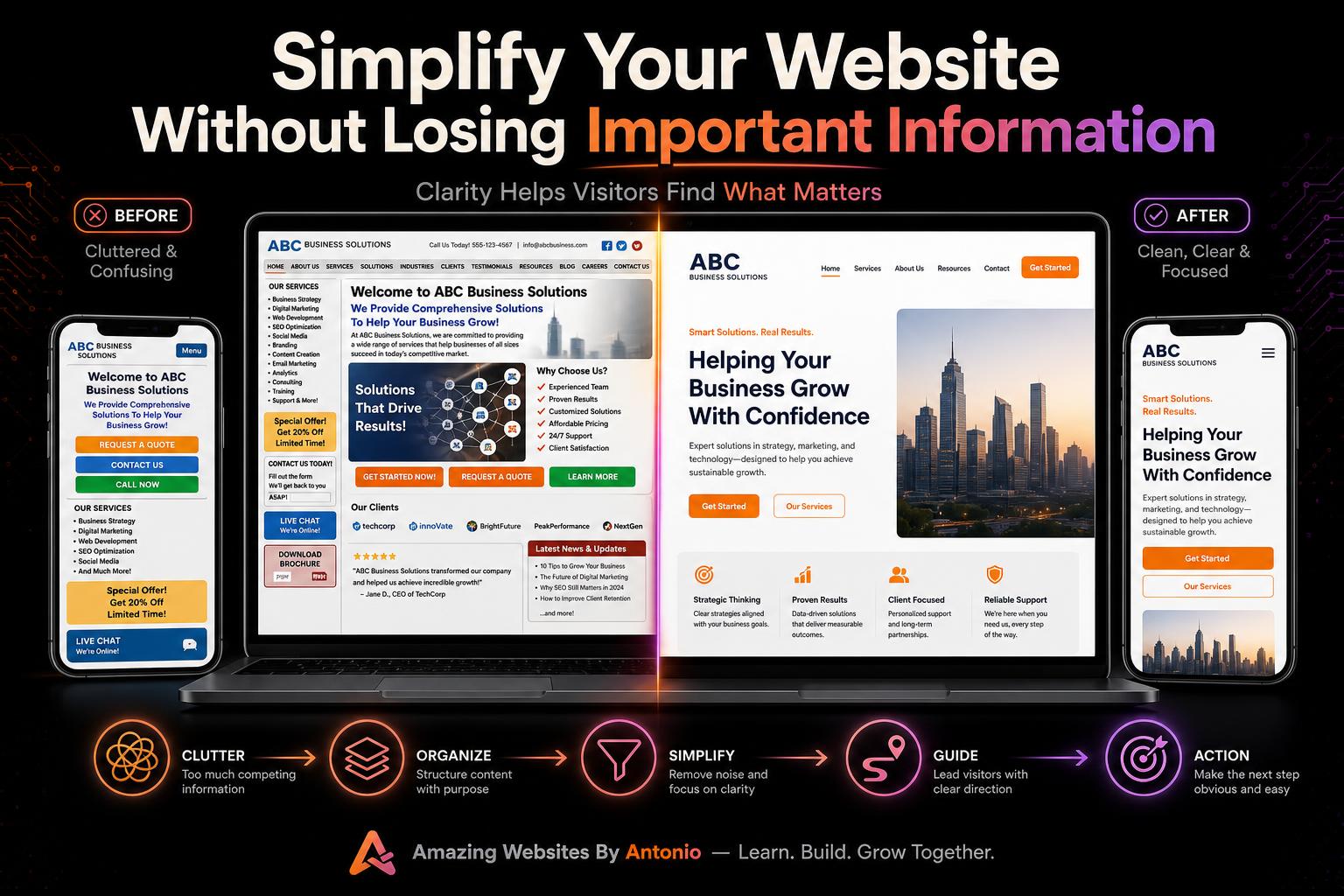
A website can contain a large amount of valuable content and still feel simple, clear, and easy to navigate. The goal isn't to remove everything. The goal is to help visitors find what matters without making them work for it.
Let's explore how.
More Information Doesn't Always Mean More Value
Business owners often assume that more content automatically creates a better website. Sometimes it does. But sometimes too much information presented at once creates confusion.
Imagine walking into a store where every product, sign, promotion, announcement, and instruction is placed directly inside the entrance. Even if everything is useful, you wouldn't know where to look first.
Websites work the same way. Visitors need direction.
Start With the Visitor's Main Goal
Before reorganizing your website, ask: Why is someone coming here?
Maybe they want to understand your services, view your work, learn about your business, buy something, contact you, find educational resources, or schedule an appointment.
Your most important information should support those goals. Not every piece of information deserves equal attention.
Create a Clear Visual Hierarchy
Visual hierarchy helps visitors understand what's most important. You can create hierarchy through headline size, font weight, spacing, color, section placement, buttons, and images.
The main message should look more important than supporting details. For example:
Main Headline: Professional Websites That Help Businesses Stand Out
Supporting Message: A short explanation of what you provide.
Primary CTA: Start Your Project
Secondary Information: Services, portfolio, testimonials, and resources.
Now the visitor has a clear starting point.
Simplify Your Navigation
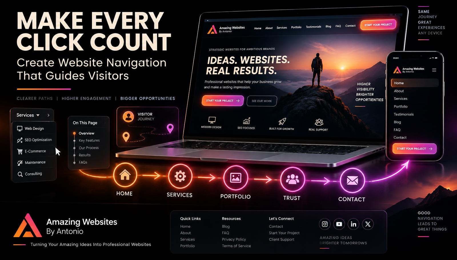
Navigation is one of the first places websites become overwhelming. As businesses grow, new pages are constantly added. Eventually, menus can become crowded.
Ask: Does every page need to appear in the main navigation? Probably not.
Important pages might include Home, About, Services, Portfolio, Blog, and Contact. Additional resources can be grouped under logical categories—for example, a Resources menu containing the AI Learning Hub, Guides, Tools, FAQs, and Blog.
Organization reduces visual clutter without removing anything.
Group Related Information Together
Instead of spreading related information throughout your website, organize it into clear sections. For example:
Website Services: New Website Design, Website Redesign, Landing Pages
AI Solutions: AI Chatbots, Automation, AI Content Support
Branding: Logo Design, Brand Identity, Digital Graphics
When information is grouped logically, visitors can understand it more quickly.
Use Short Introductions
Visitors don't always need five paragraphs before learning what a page is about. Start with a concise explanation, then provide more detail for people who want it.
Think: quick answer first, details second. That approach respects both types of visitors—people who want fast information, and people who want to learn more.
Use Expandable Content When Appropriate
Not every answer needs to be visible immediately. Features such as FAQ accordions, expandable sections, "Learn More" panels, and tabs can help keep pages organized.
For example, instead of displaying twenty full FAQ answers at once, visitors can select the question that matters to them. This technique is sometimes called progressive disclosure—you provide information when the visitor needs it rather than showing everything at once.
Break Long Pages Into Sections
Long pages aren't automatically bad. A long page can work extremely well when it's organized.
Use clear headings such as: What We Do, Who We Help, How It Works, Our Work, What Customers Say, Frequently Asked Questions, Ready to Get Started?
Now visitors can scan the page and jump to the information that interests them.
Use White Space
White space doesn't necessarily mean white. It means empty visual space around content. On a dark website, it might simply be breathing room between sections.
White space helps separate ideas, improve readability, highlight important elements, and reduce visual stress. Don't feel obligated to fill every empty area. Space is part of the design.
Limit Competing Calls to Action
Imagine a page showing Contact Us, Buy Now, Join Newsletter, Book Appointment, Download Guide, Read Blog, and Follow Facebook all at once. The visitor may not know what matters.
Choose one primary action for each page. Other actions can remain available, but they shouldn't all demand equal attention.
Use Images With Purpose
Images should support your message. Don't add graphics simply because an area feels empty.
Ask: Does this image help visitors understand something?
Good examples include portfolio work, product photos, team photographs, screenshots, diagrams, and educational visuals. Purposeful images strengthen content. Decorative overload can distract from it.
Create Better Service Pages
Some businesses try to explain every service on the homepage. That can become overwhelming quickly.
Instead, the homepage can provide a short introduction to each service. Then visitors can select: Learn More About Website Design, Explore AI Solutions, View Branding Services. Each dedicated page can provide deeper information.
Your homepage becomes the map. Service pages provide the details.
Use FAQs for Repetitive Information
If the same questions appear throughout multiple pages, consider creating a well-organized FAQ section. Questions might include: How long does a project take? Do you redesign existing websites? Do you offer AI services? How do I get started?
FAQs help remove repeated explanations while giving visitors easy access to useful information.
Create a Search Function for Large Websites
As your website grows, search can become extremely useful. This is especially true for websites with large blogs, learning centers, resource libraries, marketplaces, and extensive portfolios.
A visitor shouldn't need to manually browse dozens of pages to find one topic. Search helps large websites feel smaller.
Link Related Content Together
Instead of placing every piece of information on one page, connect pages through internal links. For example, a blog about SEO could link to Explore Our SEO Services, a branding page could link to View Branding Projects, and an AI article could link to Visit the AI Learning Hub.
This keeps individual pages focused while still giving visitors access to deeper information.
Remove Duplicate Information
Sometimes websites feel large because the same message appears repeatedly. Review your content and ask: Have I already explained this somewhere else?
If yes, you may be able to shorten one section and link to the more detailed version. Avoid making visitors read the same thing repeatedly.
Make Important Information Easy to Scan
Most website visitors don't read every word immediately. They scan.
Help them by using descriptive headings, short paragraphs, bullet points, bold emphasis, and clear buttons. A visitor should be able to understand the structure of your page even before reading every sentence.
Think Mobile First
Website clutter becomes even more noticeable on a phone. A section that feels manageable on a large desktop monitor may become exhausting on a small screen.
Check menu length, paragraph size, button placement, image size, section spacing, and pop-ups. Simplification is particularly important for mobile visitors.
Don't Confuse Simple With Empty
A simple website isn't necessarily a website with very little content. It is a website where information feels manageable.
You can have hundreds of blog posts, dozens of resources, multiple services, a large portfolio, and interactive tools—and still create a simple user experience. The secret is organization.
Simplify the Journey
Think about the path visitors take. For example: Homepage → Website Services → Portfolio → Testimonials → Contact. That's a clear journey.
Another visitor may take: Google Search → Blog Article → AI Learning Hub → Services → Contact. Different visitors can follow different paths. Your job is to make each path easy.
Use Analytics to Find Confusion
Website analytics can help identify areas that may need simplification. Look for pages where visitors leave unexpectedly, rarely continue, don't click important actions, or struggle with forms.
Analytics won't always explain why. But it can show you where to investigate.
Ask Real People to Test Your Website
One of the best ways to simplify your website is to watch someone else use it. Give them a task—for example, "Find out what website services I offer" or "Find the contact form."
Don't help them. Watch what happens. If they struggle, that's valuable information. You may know your website too well to notice where new visitors become confused.
Simplification Is an Ongoing Process
Websites grow. New services appear. New blogs are published. New tools are added. That's normal.
Periodically review your website and ask: Is this still organized logically? Can visitors find important information quickly? Does anything feel repetitive? Is the navigation becoming crowded?
Regular cleanup prevents small problems from becoming large ones.
Final Thoughts
You don't need to choose between a simple website and an informative website. You can have both.
Keep the information your visitors need. Organize it thoughtfully. Create clear hierarchy. Use strong navigation. Break large ideas into manageable sections. Guide people toward deeper information when they want it.
The goal isn't less information. The goal is less confusion.
A website should feel like a helpful guide—not a filing cabinet someone has to search through. When visitors can quickly understand where they are and where to go next, your website becomes easier to use and more valuable.
⭐ Antonio's Pro Tip
Choose your busiest webpage and perform the 10-second test. Look at the page for only ten seconds, then ask: What is the main message? What are the three most important things on this page? What should I do next?
If those answers aren't immediately clear, the page may need stronger hierarchy or simpler organization. Don't automatically delete content—first try reorganizing it.
🚀 Make Your Website Easier to Understand
At Amazing Websites By Antonio, I believe powerful websites don't have to feel complicated. Professional website design, AI-powered branding, educational resources, creative digital solutions, and interactive features can all exist within an experience that's organized and easy to navigate.
You don't have to remove the value you've built. You simply need to help visitors discover it.
Clear information. Clear direction. Clear experiences. That's what good website design should provide.
Let's build something amazing together.
Turning Your Amazing Ideas Into Professional Websites
Amazing Websites By Antonio
Creating Professional Websites, AI Solutions, and Digital Experiences That Help Businesses Thrive.
Your website navigation acts like a map. It helps visitors understand where they are, where they can go, and how to find what they need. Here are 20 ways to create navigation that guides visitors faster.
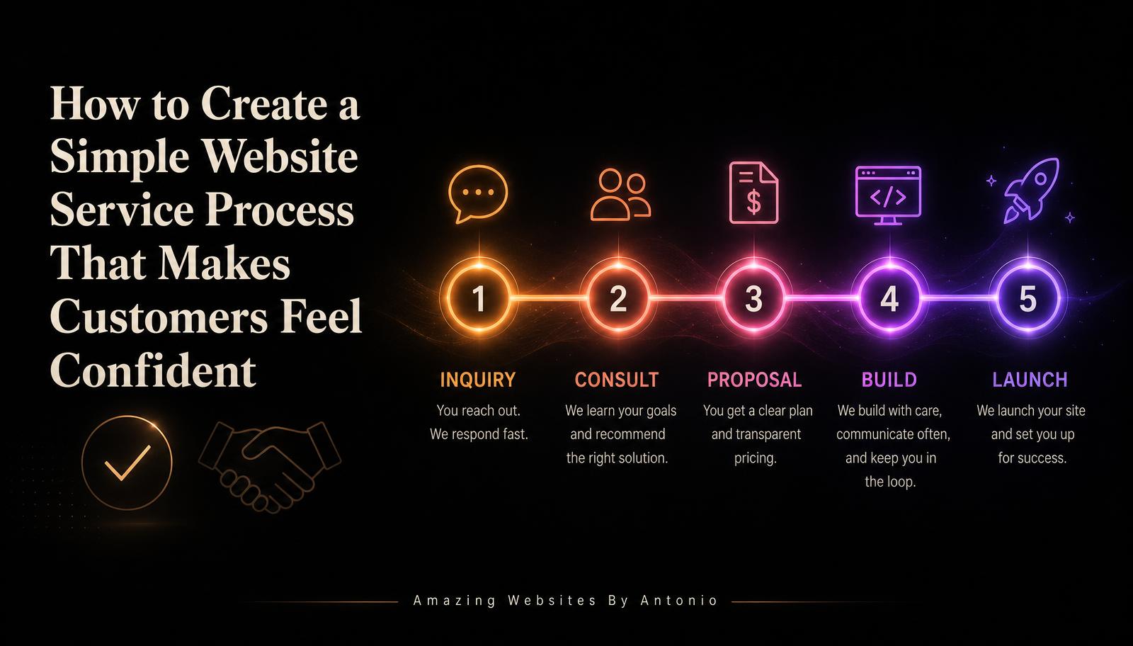
Learn how to build a clear, simple website service process that removes confusion, sets expectations, and makes customers feel confident from the first inquiry through launch and beyond.
Looking for something specific? Search across every blog post and resource.
Get new articles by email
Subscribe for new blogs, AI resources, website tips, and platform updates.
Turning Your Amazing Ideas Into Professional Websites.
Keep exploring
Continue Your Learning
Learning doesn't stop with one article. Explore more resources, practical tools, and educational guides designed to help you build your skills, strengthen your business, and grow with confidence.
🤖 AI Learning Hub
Continue building your AI knowledge with beginner-friendly lessons, practical examples, and structured learning paths.
Whether you're learning about AI, improving your website, strengthening your brand, or exploring new digital tools, every article you read brings you one step closer to achieving your goals. Our mission is to make learning practical, approachable, and valuable for everyone.
Stay Connected
Receive updates whenever we publish new educational articles, learning resources, and platform improvements.
Thank you for learning with Amazing Websites By Antonio. We're committed to helping entrepreneurs, nonprofits, creators, and small businesses continue learning, building, and growing with confidence.
Turning Your Amazing Ideas Into Professional Websites.