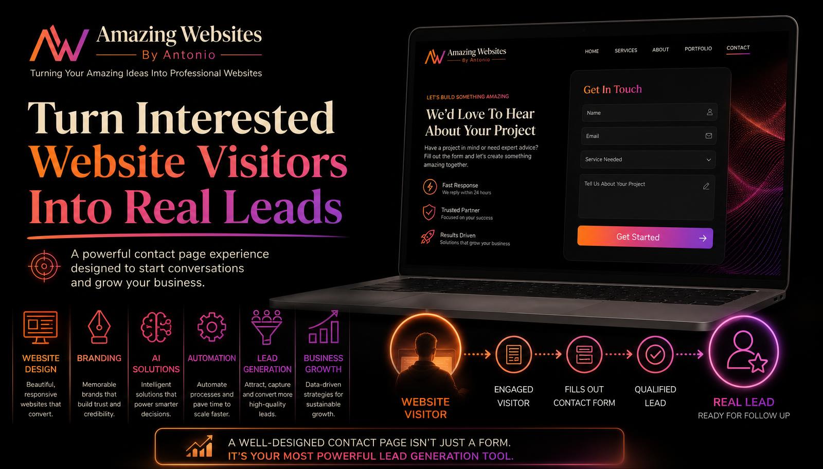
A visitor has explored your website.
They''ve learned about your services.
They''ve looked at your portfolio.
They''ve read your testimonials.
They like what they see.
Now they''re ready to contact you.
Then they reach your contact form.
It asks 25 questions.
Suddenly, contacting your business feels like filling out an application.
That can create unnecessary friction.
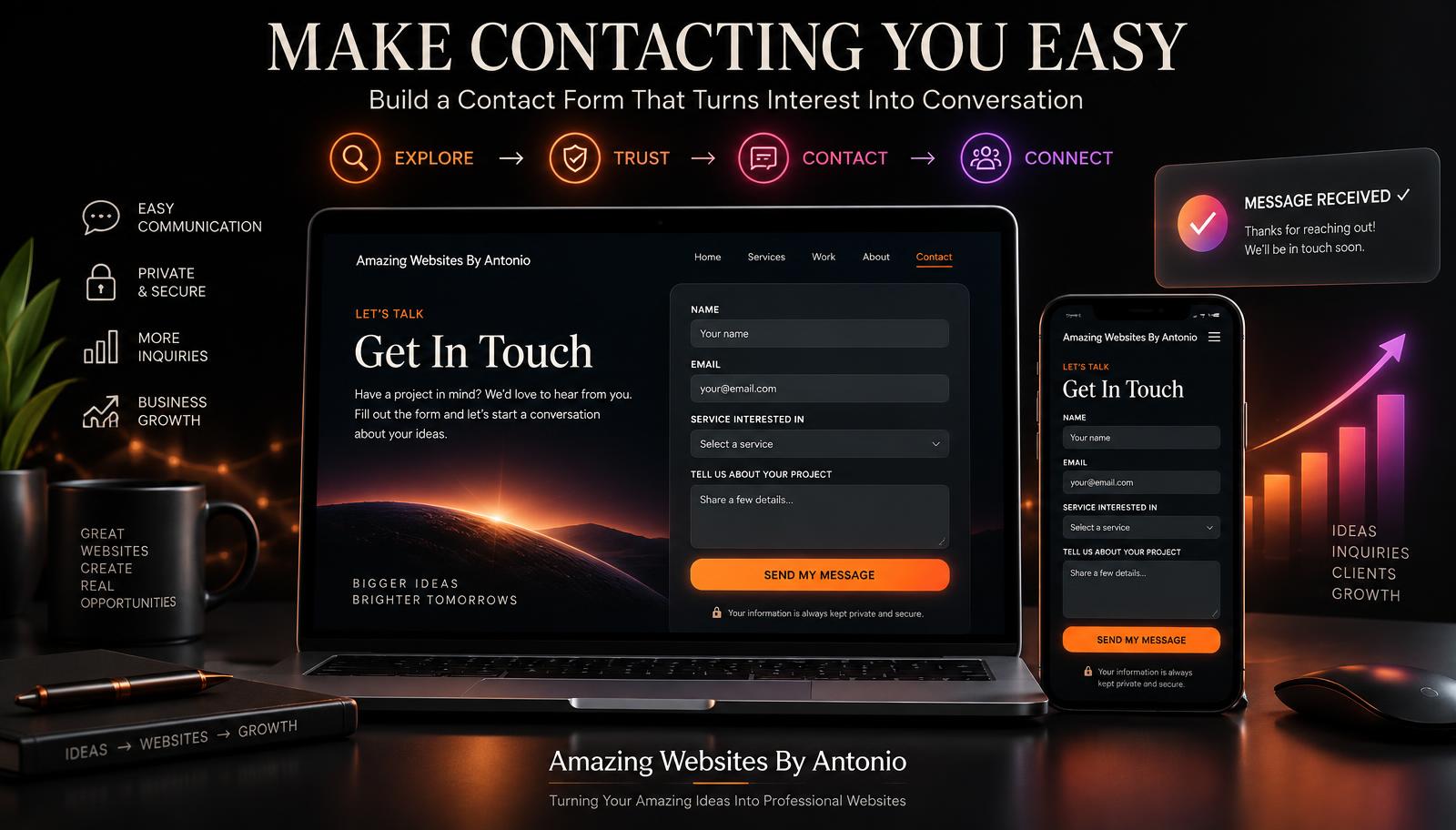
A contact form should make starting a conversation feel easy, clear, and welcoming.
It should collect enough information for you to understand what the visitor needs without making them feel overwhelmed.
Here are some ways to create a contact form that people actually want to complete.
1. Start With a Clear Purpose
Before building your form, decide what it is supposed to accomplish.
Is it for:
- General questions?
- Project inquiries?
- Quote requests?
- Consultations?
- Customer support?
- Partnership opportunities?
The purpose determines which questions you actually need.
Don''t collect information simply because you can.
2. Keep the First Contact Simple
A potential customer may not be ready to provide every detail about their project.
For a basic contact form, you might only need:
- Name
- Service interested in
- Message
- Submit
That''s enough to begin many conversations.
You can collect additional details later when they''re actually needed.
3. Only Ask for Information You Will Use
Look at every field and ask: "Why do I need this?"
If you don''t have a good answer, consider removing it.
Every additional field requires more effort from the visitor.
Necessary information creates value.
Unnecessary information creates friction.
4. Use Clear Field Labels
Visitors should immediately understand what you''re asking for.
Use labels such as:
- Full Name
- Email Address
- Phone Number — Optional
- What Service Are You Interested In?
- Tell Us About Your Project
Avoid vague labels that make people guess what information belongs in a field.
5. Mark Optional Fields Clearly
If something isn''t required, say so.
For example:
- Phone Number — Optional
- Business Name — Optional
- Website — Optional
This gives visitors more control over what they share during the first interaction.
6. Use a Service Dropdown When Helpful
If you provide several services, a dropdown can help organize inquiries.
For example:
What can we help you with?
- Website Design
- Branding
- AI Solutions
- Automation
- Digital Tools
- Website Updates
- Other
This can help you understand the inquiry before responding.
7. Give People Room to Explain Their Idea
Include an open message field.
Instead of simply labeling it "Message," try something more inviting:
Tell Us About Your Amazing Idea
Supporting text could say:
"Share a little about what you''d like to create, improve, or accomplish."
This gives customers direction without forcing them into a complicated questionnaire.
8. Don''t Require a Phone Number Unless You Need It
Some visitors may prefer email communication.
Requiring a phone number when it isn''t necessary can discourage someone from submitting the form.
If phone contact isn''t essential, consider making the field optional.
9. Explain What Happens Next
One reason people hesitate to submit forms is uncertainty.
Tell them what to expect.
For example:
What happens next?
- Submit your message.
- We''ll review your request.
- We''ll contact you to discuss the next steps.
A simple explanation can make the process feel more comfortable.
10. Use a Strong Submit Button
"Submit" works.
But you can make the button feel more connected to the experience.
Consider:
- Send My Message
- Start My Project
- Let''s Talk
- Send My Project Idea
- Request Information
Choose wording that accurately reflects what happens after the button is clicked.
11. Add a Friendly Introduction
Don''t place a form on the page without context.
Welcome the visitor first.
For example:
Have an amazing idea?
Tell us a little about what you''re working on. Whether you''re exploring a professional website, branding, AI-powered solutions, automation, or another digital project, we''d love to hear about your idea.
Then show the form.
12. Build Trust Around the Form
Visitors may wonder what happens to their information.
Be transparent.
If appropriate, include a short privacy message such as:
"Your contact information will be used to respond to your inquiry and will not be displayed publicly."
Only make privacy promises your business can actually honor.
If your website collects personal information, make sure your practices and policies accurately explain how it is handled.
13. Make Error Messages Helpful
Sometimes people forget a required field or accidentally enter information incorrectly.
Don''t simply display "Error."
Tell them what needs to be fixed.
For example:
- "Please enter a valid email address."
- "Please tell us a little about your project before submitting."
Helpful error messages make corrections easier.
14. Preserve Information When There Is an Error
Few things are more frustrating than filling out a form, making one small mistake, and losing everything you typed.
Whenever possible, preserve the visitor''s completed information when a validation error occurs.
Let them correct the problem instead of starting over.
15. Make the Form Mobile-Friendly
Many people will contact your business from a smartphone.
Test your form on smaller screens.
Make sure:
- Fields fit the screen
- Text is readable
- Buttons are easy to tap
- Dropdowns work
- The keyboard doesn''t cover important fields
- Error messages are visible
- The form isn''t unnecessarily long
A form that works beautifully on desktop should also work beautifully on mobile.
16. Confirm Successful Submission
After someone sends a message, don''t leave them wondering whether it worked.
Display a clear confirmation.
For example:
Thank you!
Your message has been received.
We appreciate you reaching out to Amazing Websites By Antonio and look forward to learning more about your idea.
This creates reassurance and completes the interaction.
17. Create a Useful Thank-You Page
Instead of only displaying a tiny success message, consider sending visitors to a dedicated thank-you page.
That page could include:
- Confirmation that the message was received
- What happens next
- Links to your portfolio
- Helpful blog posts
- Your FAQ
- Additional resources
The contact form may be submitted, but the customer journey doesn''t have to end.
18. Protect Your Form From Spam
Public contact forms can attract spam.
Use appropriate anti-spam tools that don''t make the experience unnecessarily difficult for legitimate visitors.
Depending on your website platform, options may include:
- Spam filtering
- Honeypot fields
- Rate limiting
- CAPTCHA or similar verification when needed
Balance security with usability.
19. Test the Form Yourself
Never assume your contact form works because it looks good.
Test it.
Submit a message.
Check:
- Did the form send successfully?
- Did the confirmation appear?
- Did the message reach the correct destination?
- Does the email address display correctly?
- Does it work on mobile?
- Do required fields behave properly?
- Do error messages make sense?
Test again whenever you make significant website changes.
20. Don''t Let Leads Disappear
A perfect contact form isn''t useful if nobody receives the submissions.
Make sure inquiries are routed to a place you actually monitor.
Have a clear process for reviewing and responding to legitimate inquiries.
Your website can open the door.
Your follow-up continues the relationship.
21. Consider a Separate Project Intake Form
A simple contact form and a detailed project intake form don''t have to be the same thing.
Your Contact page can make the first conversation easy.
Then, when someone is ready to begin a project, you can send them to a more detailed intake form.
That form might ask about:
- Business information
- Project goals
- Target audience
- Required pages
- Branding
- Features
- Timeline
- Budget range
- Existing website
- Content
This keeps your initial contact experience simple while still allowing you to collect detailed information later.
22. Respect the Visitor''s Time
The best contact form isn''t necessarily the one that collects the most information.
It''s the one that collects the right information.
Your visitor is taking a step toward your business.
Make that step easy.
Final Thoughts
A contact form may look like a small part of your website.
But it can represent a very important moment.
A visitor is moving from "I''ve been looking around" to "I''m interested enough to reach out."
Don''t make that moment harder than it needs to be.
Keep the form clear.
Ask only what you need.
Explain what happens next.
Make it work beautifully on mobile.
Confirm that the message was received.
And most importantly, make starting a conversation feel welcoming.
Your website has worked hard to guide the visitor this far.
Now make the final step easy.
Amazing Websites By Antonio
Turning Your Amazing Ideas Into Professional Websites